Problem
Direct Line for business did not have an online quote and buy journey. It was deemed too complicated due to all of the variables each business could have. This meant each quote had to be handled manually which was time consuming, costly and not a good experience for potential customers.
My role
Lead and project manage the design and dev team at buffalozoomedia. Act as lead UX designer within the team and report directly to the stakeholders at Direct Line. Manage handover of assets and front-end code to DL’s technology partner. Plan and implement future phases of incremental updates. I followed this process so that the entire project team understood what we were trying to achieve at each stage:
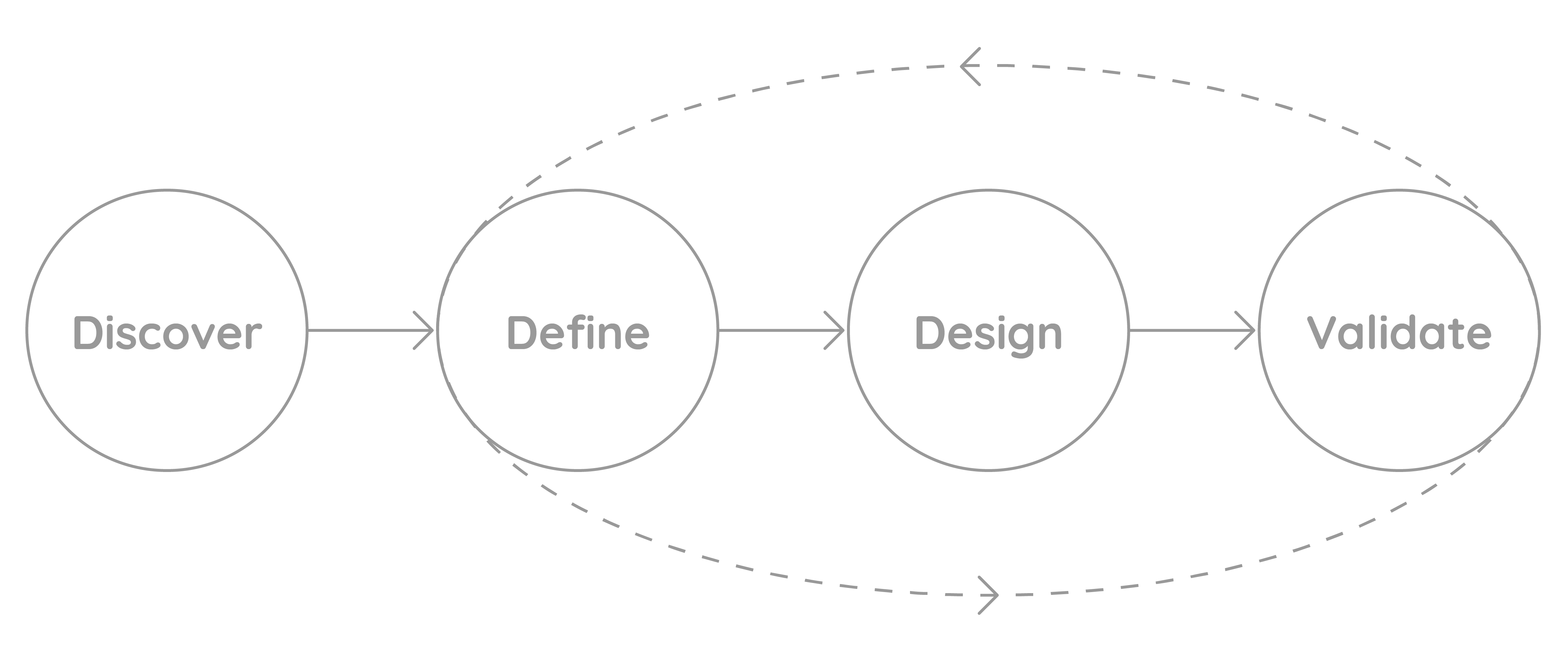
Discover:
I collaborated with Direct Line staff to review the problem and advise on how to optimise the journeys.
What became clear was that the insurance products needed to be tailored to individual, specific businesses. For instance, a hairdresser might have several locations, all of which could be different types of building. Thy might also have a mixture of permanent and part-time staff, stock in the form of products and maybe a vehicle to include. Roll that out for multiple types of business and it soon becomes very complex.
The goal was to keep the application process to 20 minutes. This was to minimise the amount of abandoned applications.
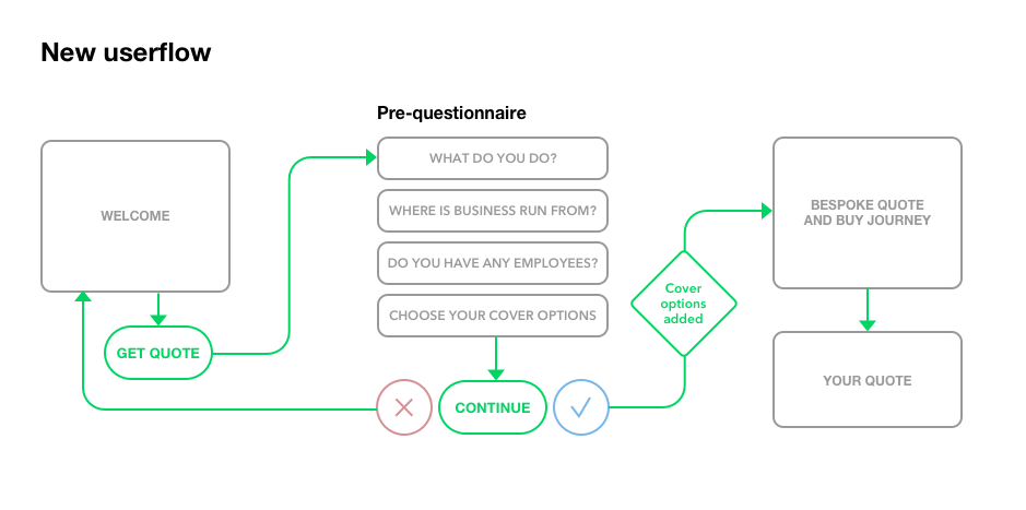
As this was a first for the business insurance team, we only had historical speech analytics data to go from. We used these real life scenarios to understand the pain points and also to highlight areas where compliance had to be adhered to. We discovered that although the existing offline phone application wasn’t ideal, it had a conversational quality to it which helped to optimise the journey. By replicating this and asking pertinent questions up front (in the form of a pre-questionnaire) we realised we could then make the application journey itself more bespoke and therefore more relevant and quicker for each individual.
Define:
From the initial discover phase, DL staff compiled the question sets for each business scenario in excel spreadsheets. We decided to concentrate on a beauty businesses scenario, for the MVP roll out and user tests. We started with the application pre-questionnaire, which we wanted to make as intuitive and speedy as possible.
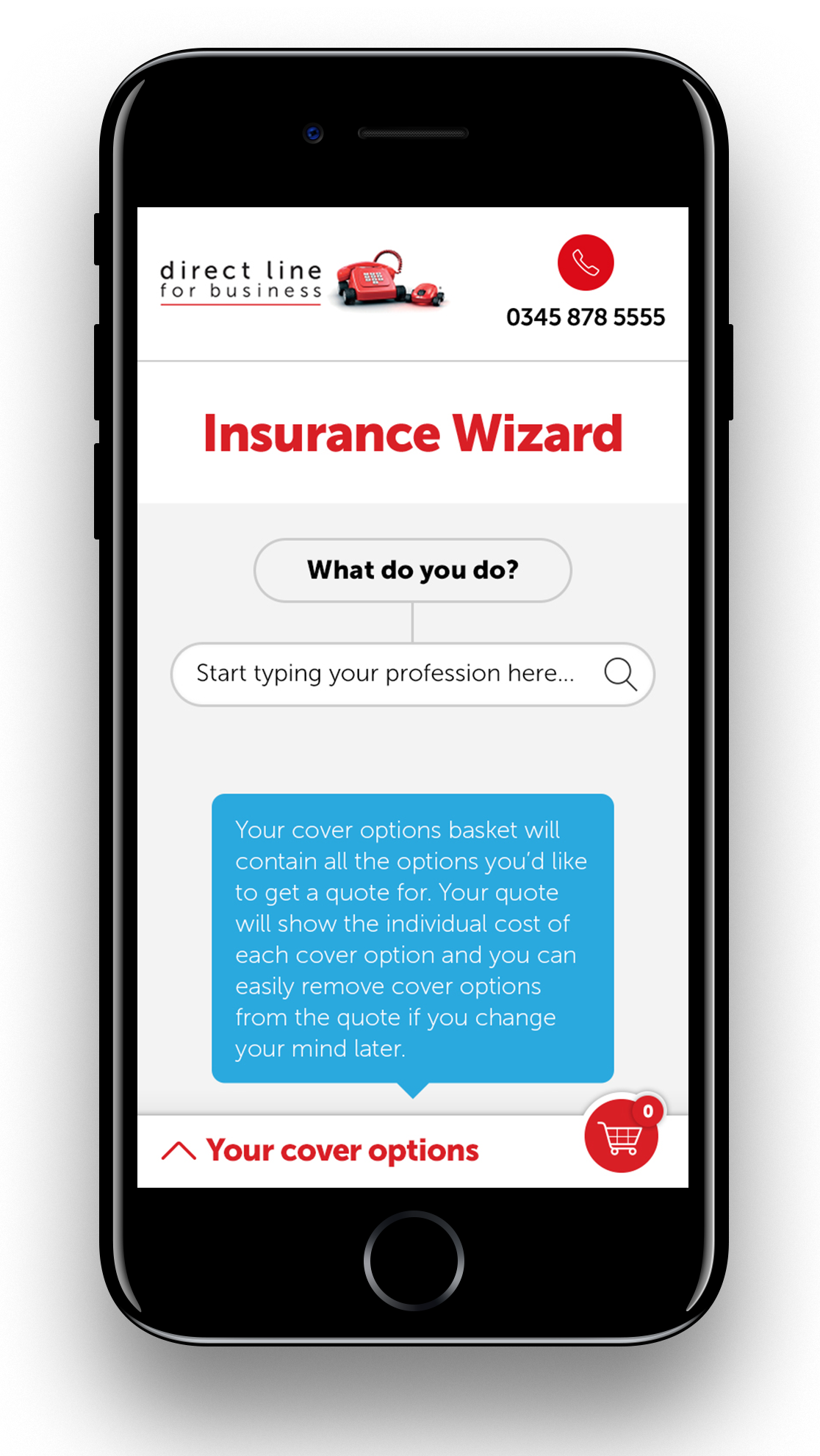
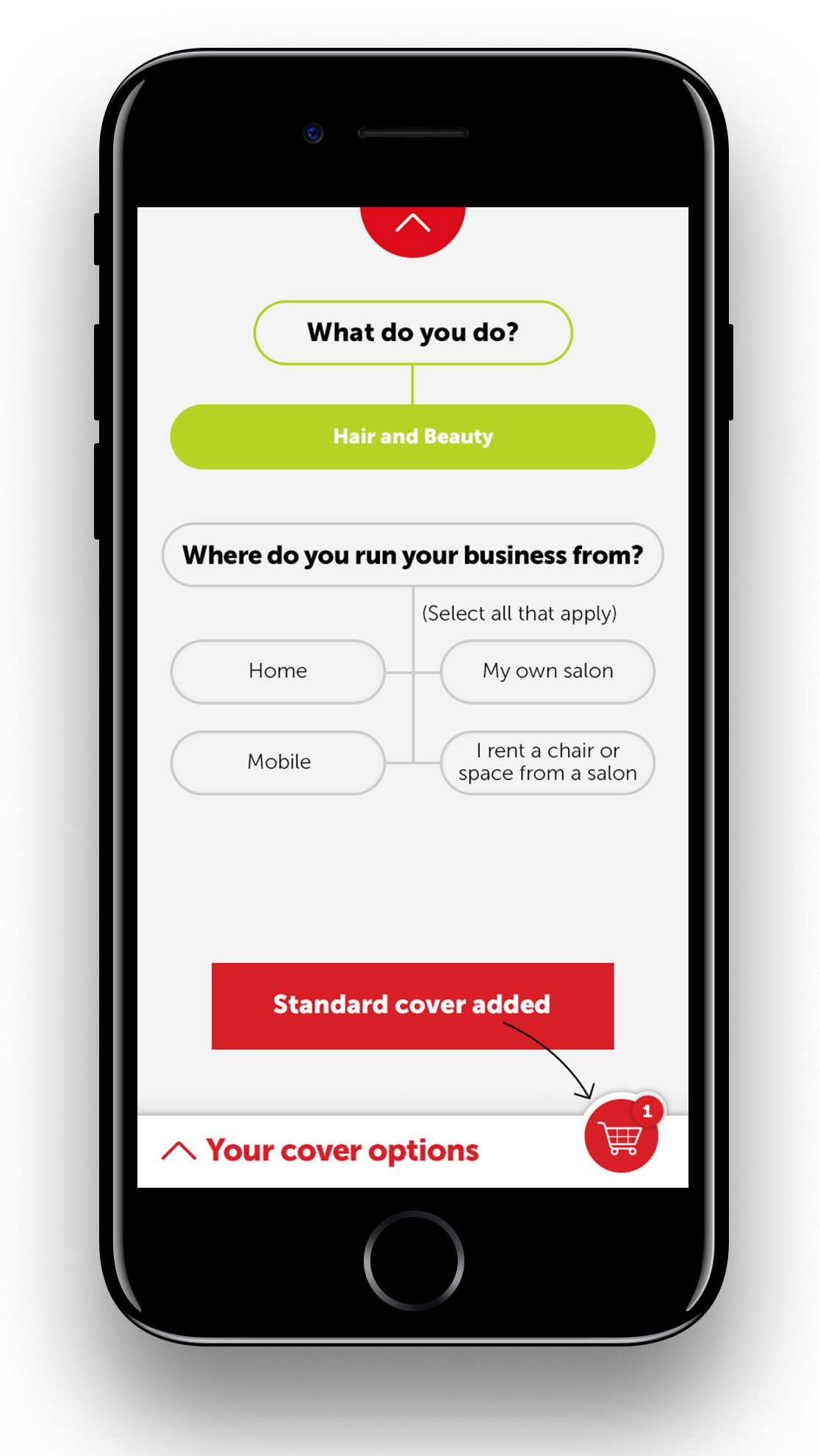
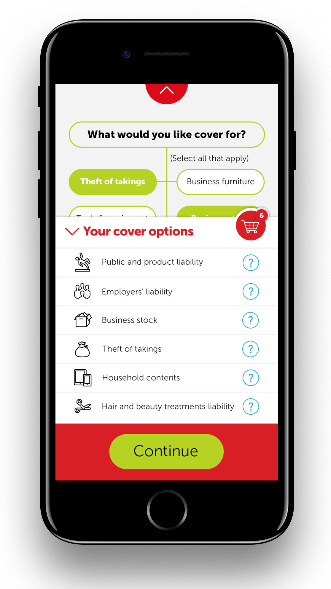
In my role as lead UX designer I created a simple interface that adds insurance products to the users basket as they answer the pre-questionnaire. This is a transparent user-centred process that tells the customer exactly what products they will be offered as part of their quote. It also means that the remaining quote and buy journey is now shorter as it’s personalised to that users needs. They will not see any questions that do not relate to their individual quote. From Direct Line’s point of view, it also means the quote will be more accurate and, therefore, more competitive.
Design:
Direct Line already had a distinctive, mobile-first style in place for their forms. However, as we had created a new journey we needed to design new components whilst staying true to this style. It was my responsibility to make sure that not only the agreed solution was carried forward, but that the designers understood and respected Direct Line’s style. At the same time I wanted to give designers and developers enough freedom to discover and suggest additional solutions that would further improve the experience.
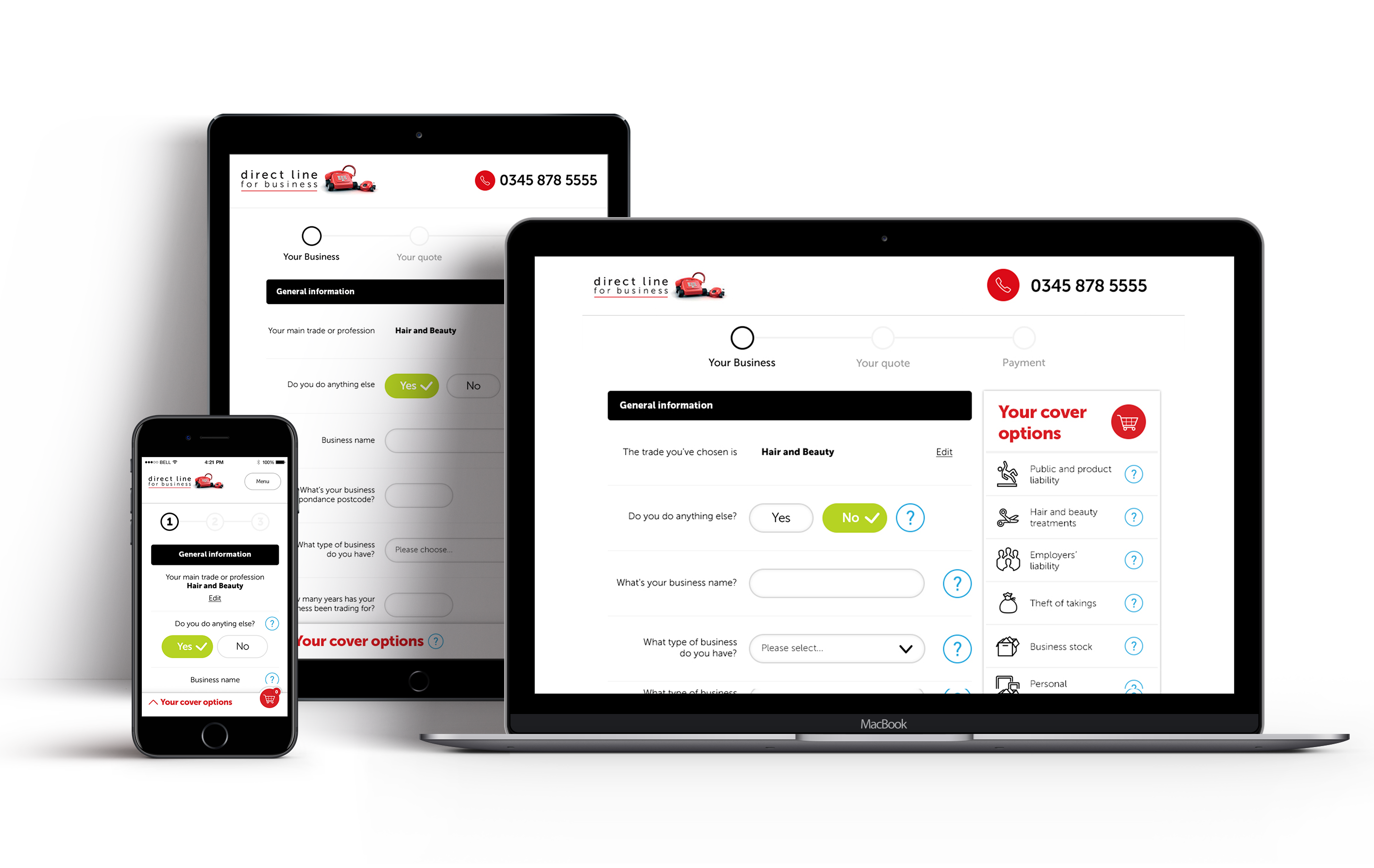
Both design and development had to be done to meet AAA accessibility standards. The dev team, in particular, worked very hard to achieve that whilst also understanding the needs of the technology supplier responsible for the back-end and integration.
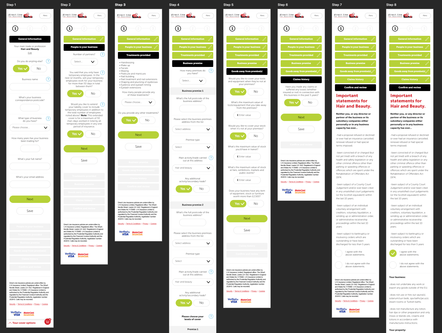
The design and dev team that I managed got involved in regular presentations to the stakeholders and partners. Where problems arose, we worked very quickly to come up with a solution that would not interfere with the experience.
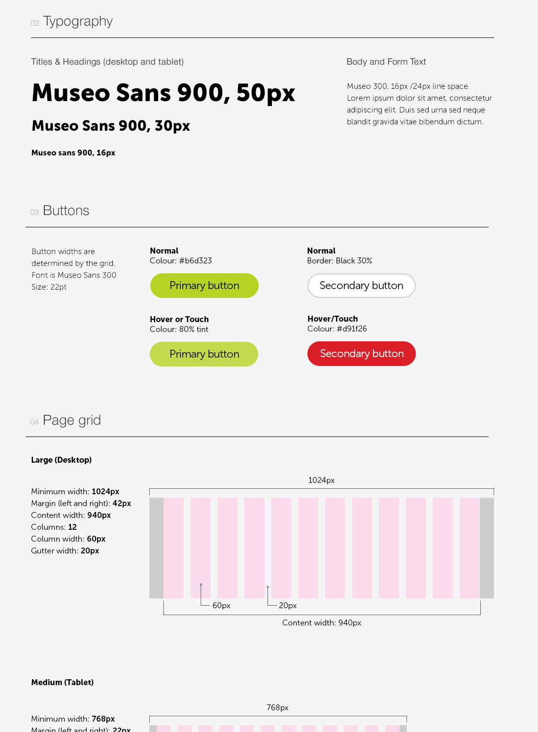
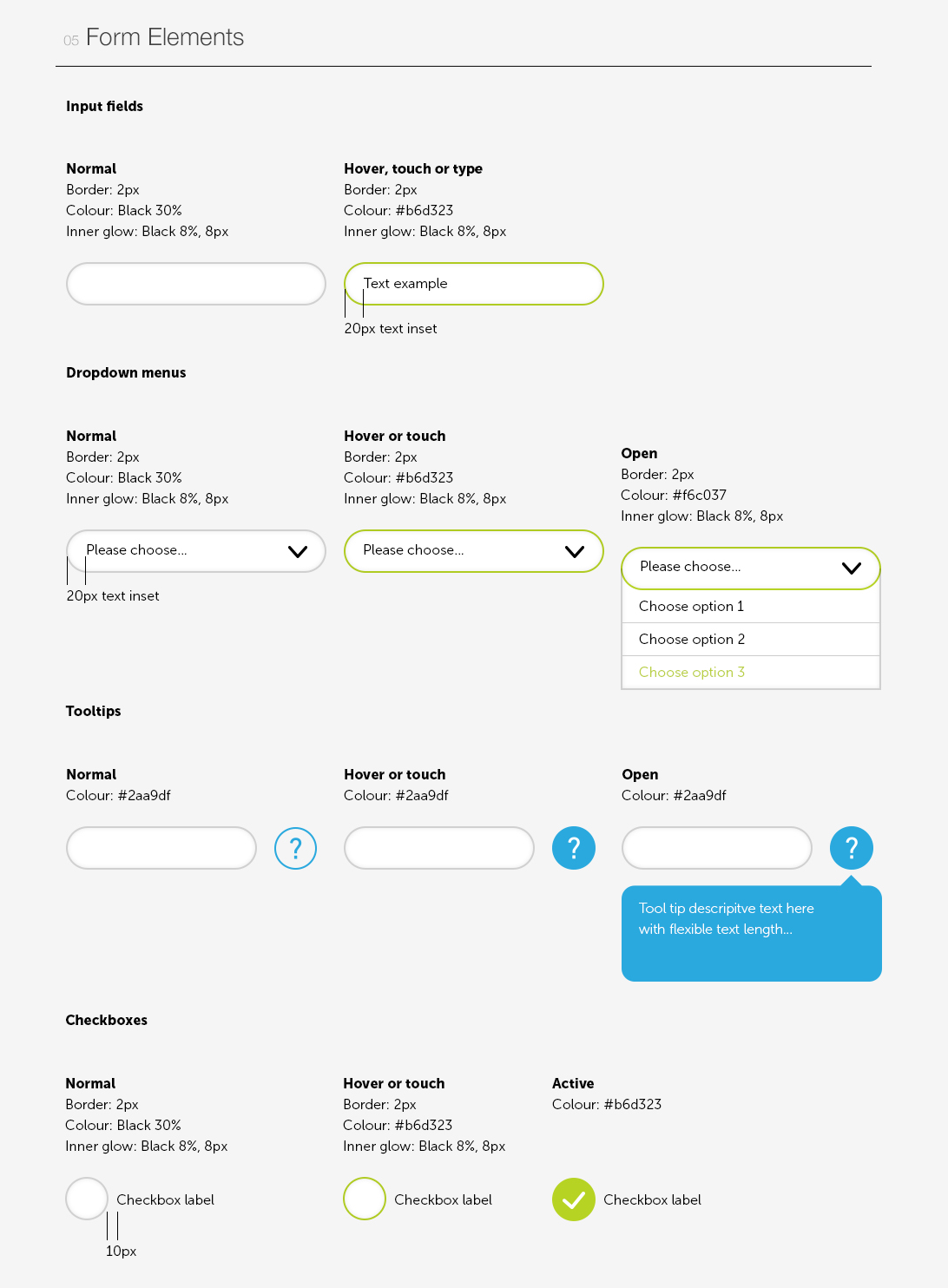
Styleguide
During the design phase I developed a styleguide which was accessible and valuable to all members of the team. This ensures consistency in the look and feel is maintained, as the product is developed and iterated.
