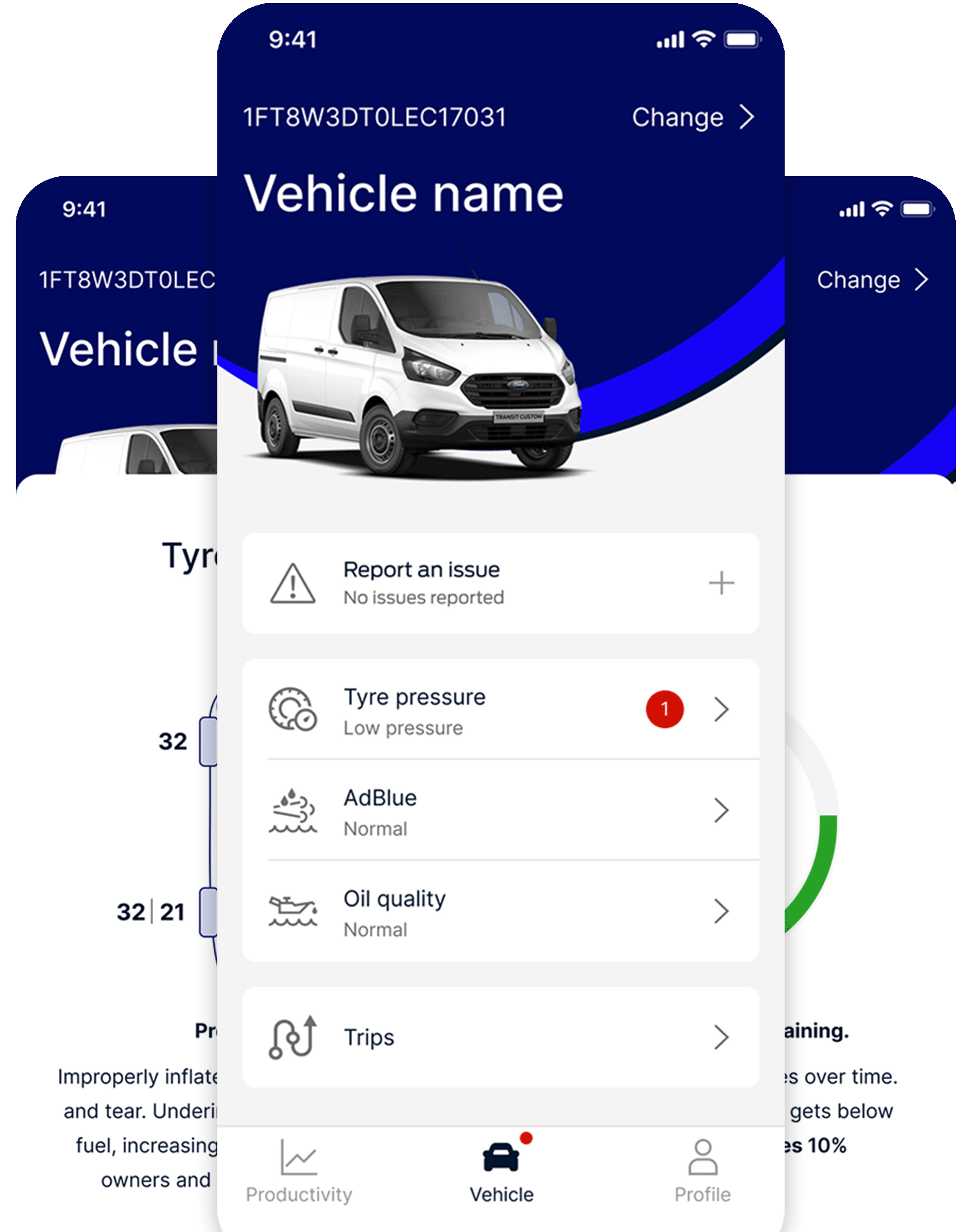
Case Study.
As Lead UX/UI Designer in an agile squad, I led the redesign of a native mobile app for Ford Pro, targeting small to medium-sized fleet operators. This case study focuses on improving engagement with Vehicle Health Alerts, a core feature designed to keep fleet vehicles on the road through pre-emptive maintenance notifications.
The Challenge
Support the business: Re-purpose an existing app, that was not built for the target audience and gradually iterate on features. Leverage the existing desktop software solution and liaise with the global team. Manage an evolving brief and strategy whilst upholding insights revealed by our team through user research.
Vehicle Health Alert problems
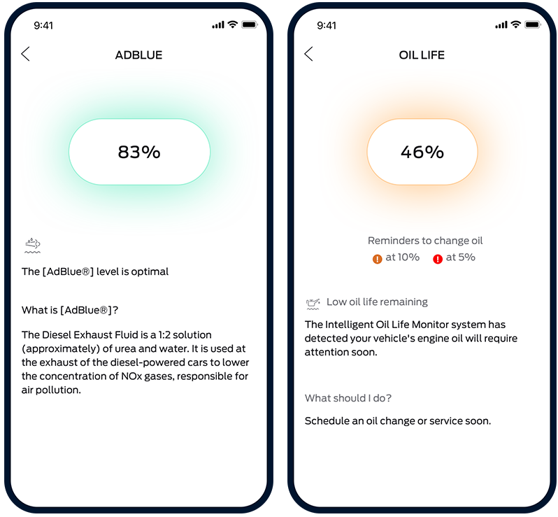
Ford Pro’s analytics revealed that users were not engaging with Vehicle Health Alerts, undermining the app’s key value proposition. Fleet drivers ignored VHA notifications, often relying on dashboard warnings or routine checks instead. Multiple UX issues contributed to the problem:
Discovery
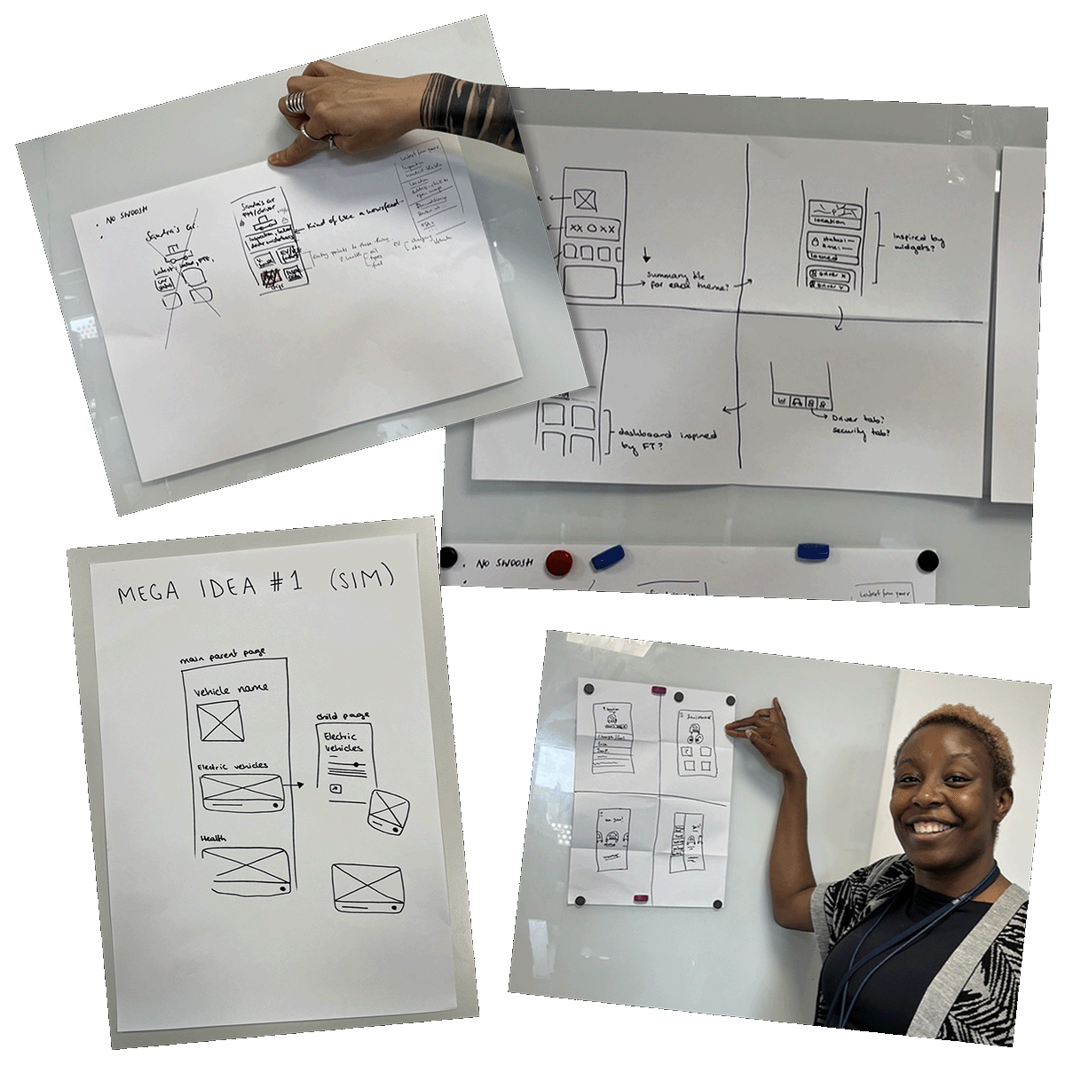
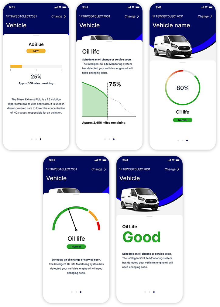
To uncover root causes, I initiated a design workshop with the product and engineering teams, followed by a Crazy 8’s ideation session. To get the most value from these sessions, I set the theme: ‘How can we respond to the particular problem of differentiating between ‘quality’ and ‘levels’?
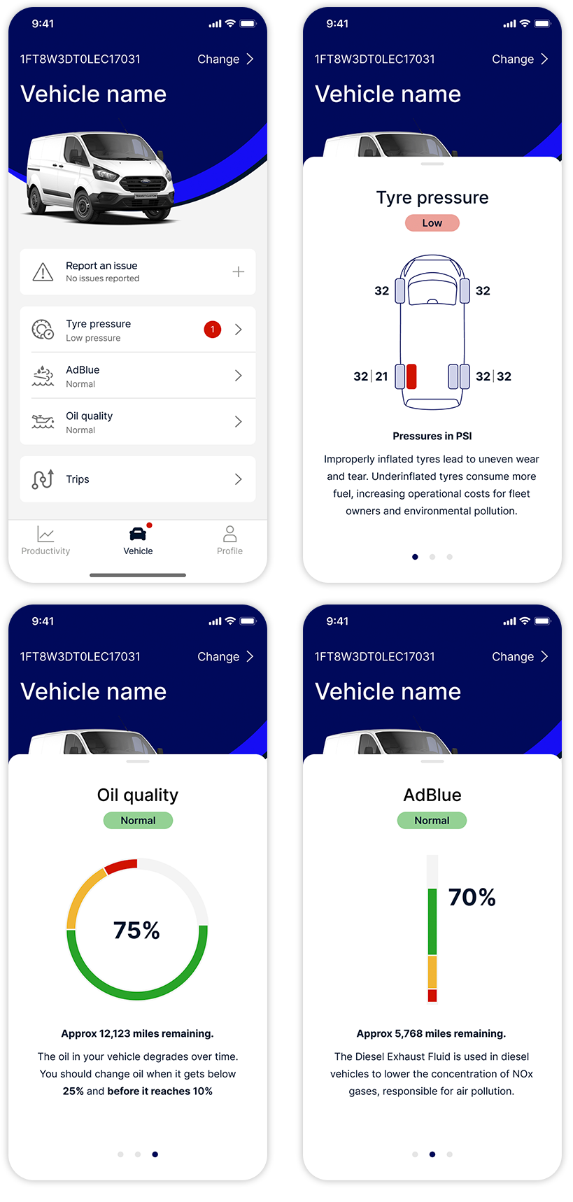
These collaborative efforts surfaced multiple hypotheses and led to the creation of new visualisation concepts that better differentiated oil quality from quantity.
Design explorations.
We explored a range of visual metaphors and interaction patterns for Vehicle Health Alerts. Key goals were clarity, intuitiveness, and reduced cognitive load. Design ideas were continuously reviewed with Engineering leads to evaluate technical feasibility and I conducted some user testing with colleagues, before deciding which options to develop further.
Validation & user testing
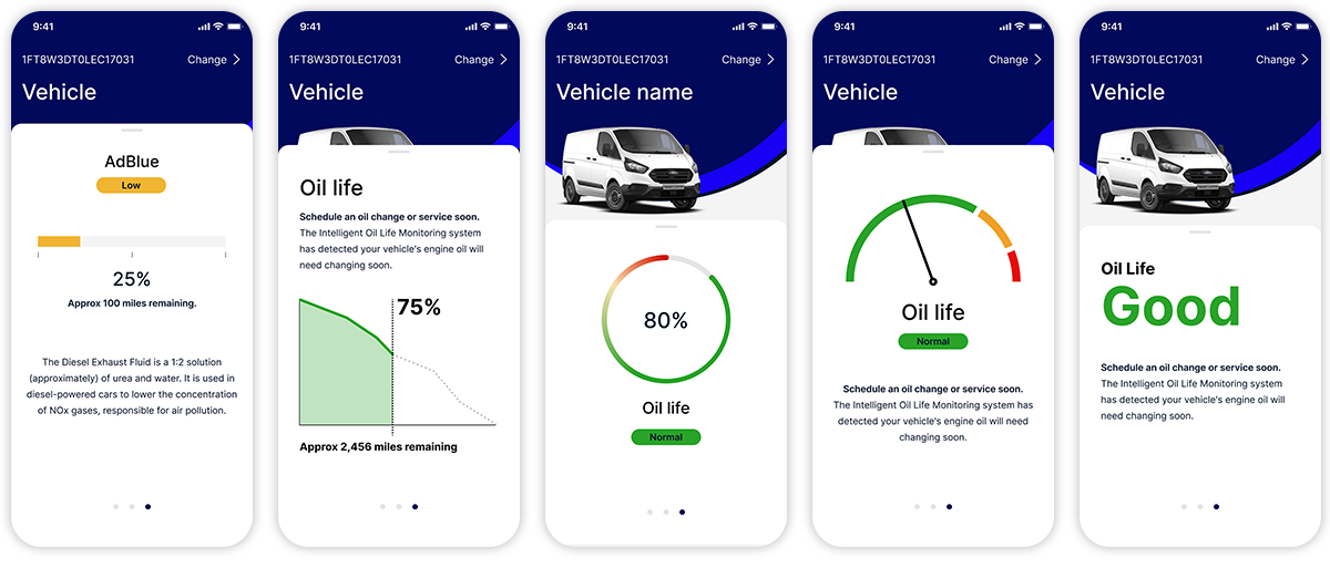
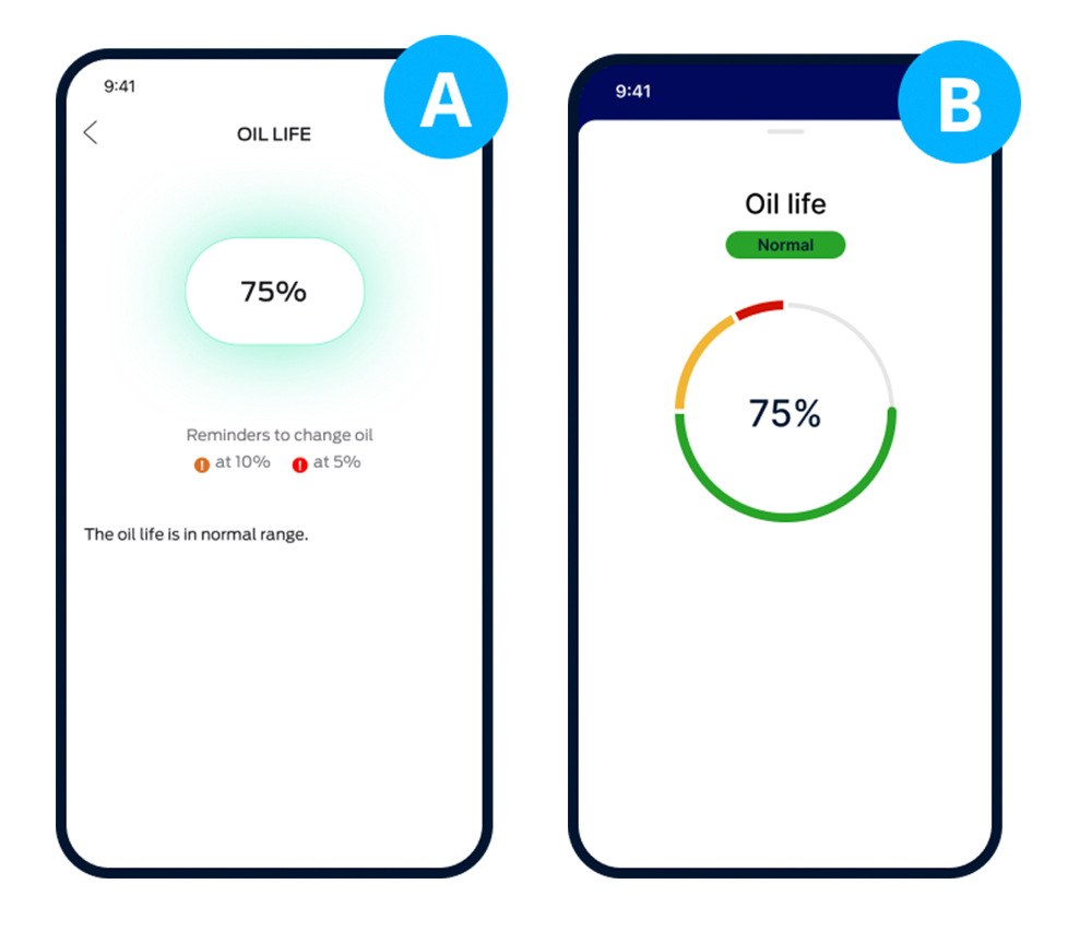
I conducted two rounds of remote, unmoderated user testing. An A/B test with 30 participants to compare the existing design with our new proposed solution. This was repeated as a B/A test with a new set of 30 participants, to remove any bias from the test results.
Accessibility
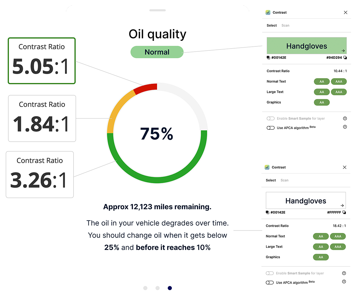
Accessibility is always a priority. I use a mix of figma plug-ins and webaim.org colour contrast checker to ensure visual elements met AAA standards for text contrast, and at least AA for graphical elements.
Designs were tested against common types of color blindness (protanopia, deuteranopia) to ensure clarity for all users.
Accessibility checks highlighted issues with this style of data visualisation.
Final design solution
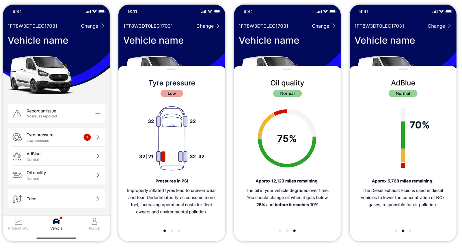
Final design solution
Outcomes
The redesigned Vehicle Health Alerts experience significantly improved user understanding and engagement. With 72% of users preferring the new interface and an 80% success rate in interpreting critical oil life status, the feature now aligns much more closely with Ford Pro’s preventative maintenance goals. The solution laid a strong foundation for further enhancements to fleet management tools on mobile and contributed to the evolving design system.
