Case Study.
Anthropos Pro is a connected care solution for the home. Anthropos builds a rich picture of the daily routine of older people living alone. Based on their daily routine, the environment in which they live, their wellbeing and their safety and security.
The Challenge
The Anthropos portal was originally designed with desktop users in mind, leaving the mobile experience inconsistent, limited, and frustrating. With no designer involved in the original build, the platform lacked usability and accessibility – crucial gaps considering the target audience: non tech-savvy carers monitoring elderly relatives through in-home sensors. Data was hard to interpret, and the experience didn’t reflect the empathy or simplicity the users needed.
My Role
As the sole Product Designer on the project, I worked directly with senior leadership, engineers, and marketing to lay the groundwork for a user-first redesign.
Where we started
1. Competitor audit
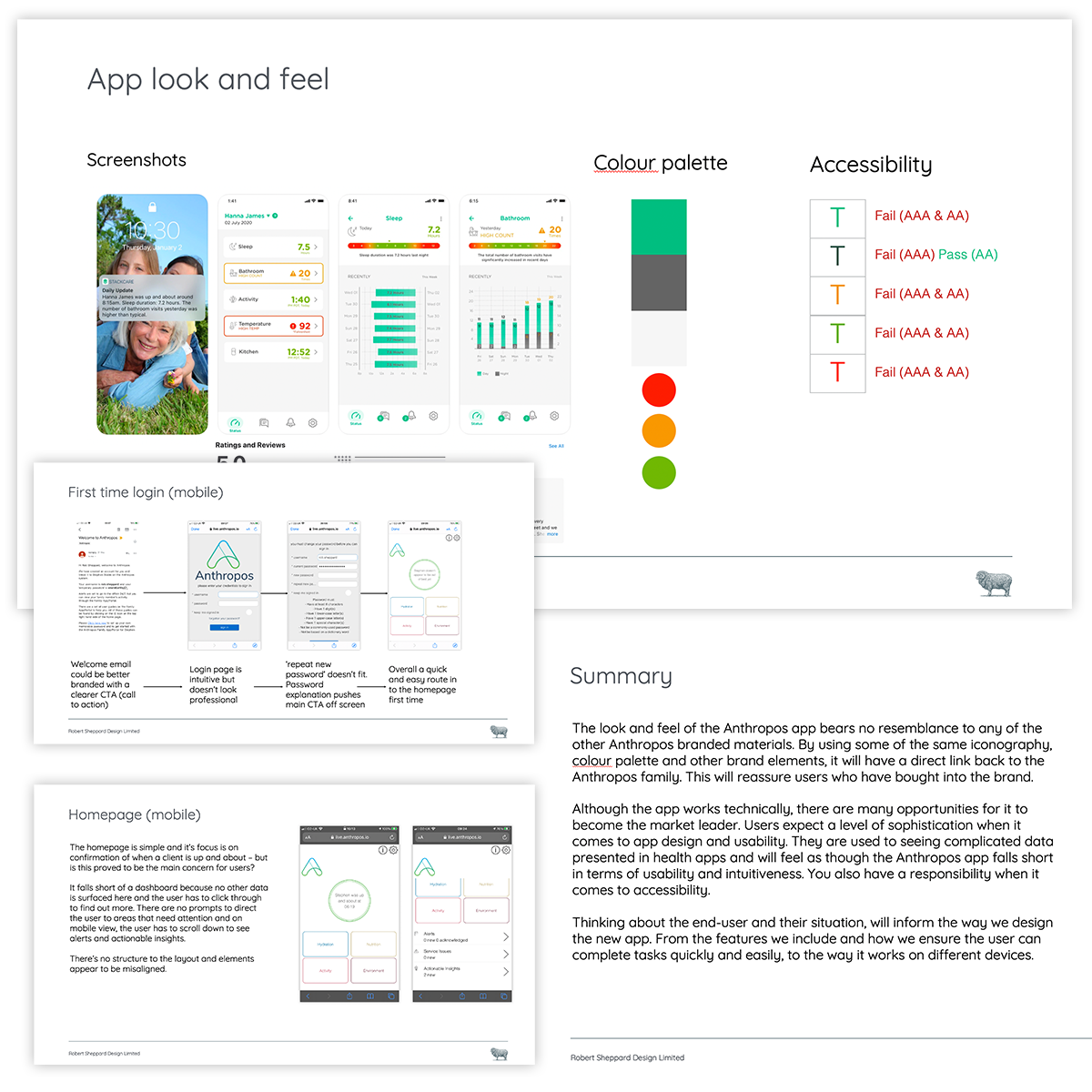
To kick off, I evaluated four competitors – assessing branding, feature sets, and overall user experience. Rather than dwell on what Anthropos lacked, I used the analysis to identify actionable opportunities: cleaner UI, clearer insights, and stronger brand cohesion.
2. Heuristic review
I then reviewed the existing platform across desktop and mobile, focusing on key user touchpoints like onboarding, data views, and alerts. I mapped out user flows, highlighted friction points, and layered in feedback from actual users. My recommendations centered on consistency, accessibility, and emotional clarity – especially important given the sensitive nature of care-based monitoring.
3. Recommendations
The insights revealed a clear path forward: align the portal with Anthropos’ brand, elevate usability to meet modern expectations, and design with empathy. Though technically functional, the portal needed to reflect the sophistication users experience elsewhere, especially in health-related apps. With a mobile-first, accessible design and a focus on simplicity, Anthropos had the opportunity to leap ahead of its competitors.
UX: Information architecture & user flows
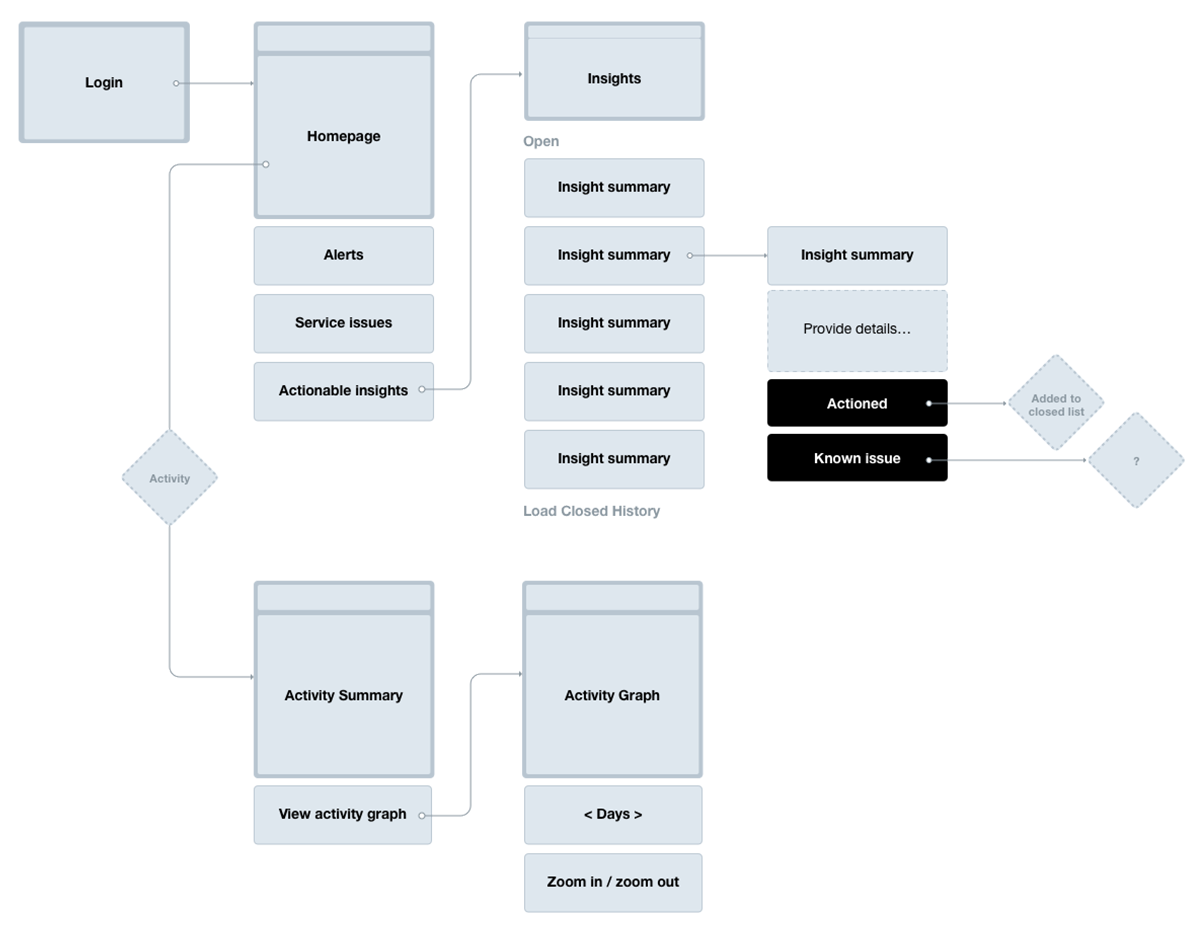
A major part of the redesign focused on reworking the app’s Information Architecture and refining key user flows, not only to improve the current experience but to build a foundation for future scalability.
The original app lacked structure, especially around core features like alerts and insights, which are essential for family members monitoring their loved ones. I reorganised features into intuitive groups to align with the user’s mental model, ensuring they could navigate the app with confidence, not confusion.
Clear user flows were created for critical tasks, making sure users could complete actions quickly and intuitively. These weren’t just design artifacts, they became alignment tools.
• Engineering used them to identify technical dependencies.
• Marketing used them to validate proposed features with real users.
• Product Design used them to define reusable UI patterns and spot opportunities for scalable design components.
Leveraging AI for rapid prototyping.
To evaluate features and usability, I wrote prompts for AI tools (using a combination of Chat GPT, Claude and Stitch) to create interactive wireframes. After aligning with stakeholders on feasibility and prioritising features into must-haves and nice-to-haves, we presented the wireframes to real users for feedback. Their input guided rapid iterations, driven by refined AI prompts. This approach significantly accelerated our process, enabling us to validate the app concept early, before committing to full-scale design.
UI: Designing the mobile app interface
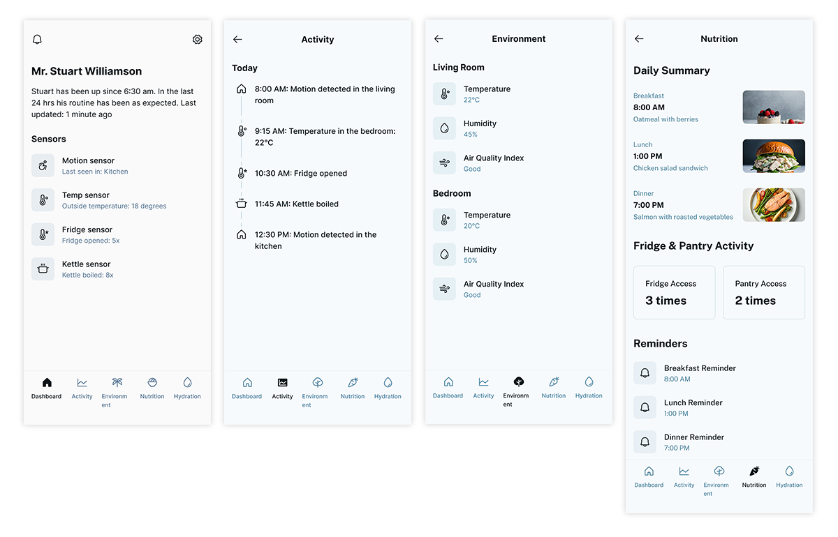
With the structure in place, I turned to interface design, running design discovery for each section and creating multiple prototypes for testing with users and stakeholders.
Pain points from earlier phases guided the design:
• Poor menu organisation made features hard to find.
• Data was overwhelming, lacking summaries and actionable insights.
A smarter home screen
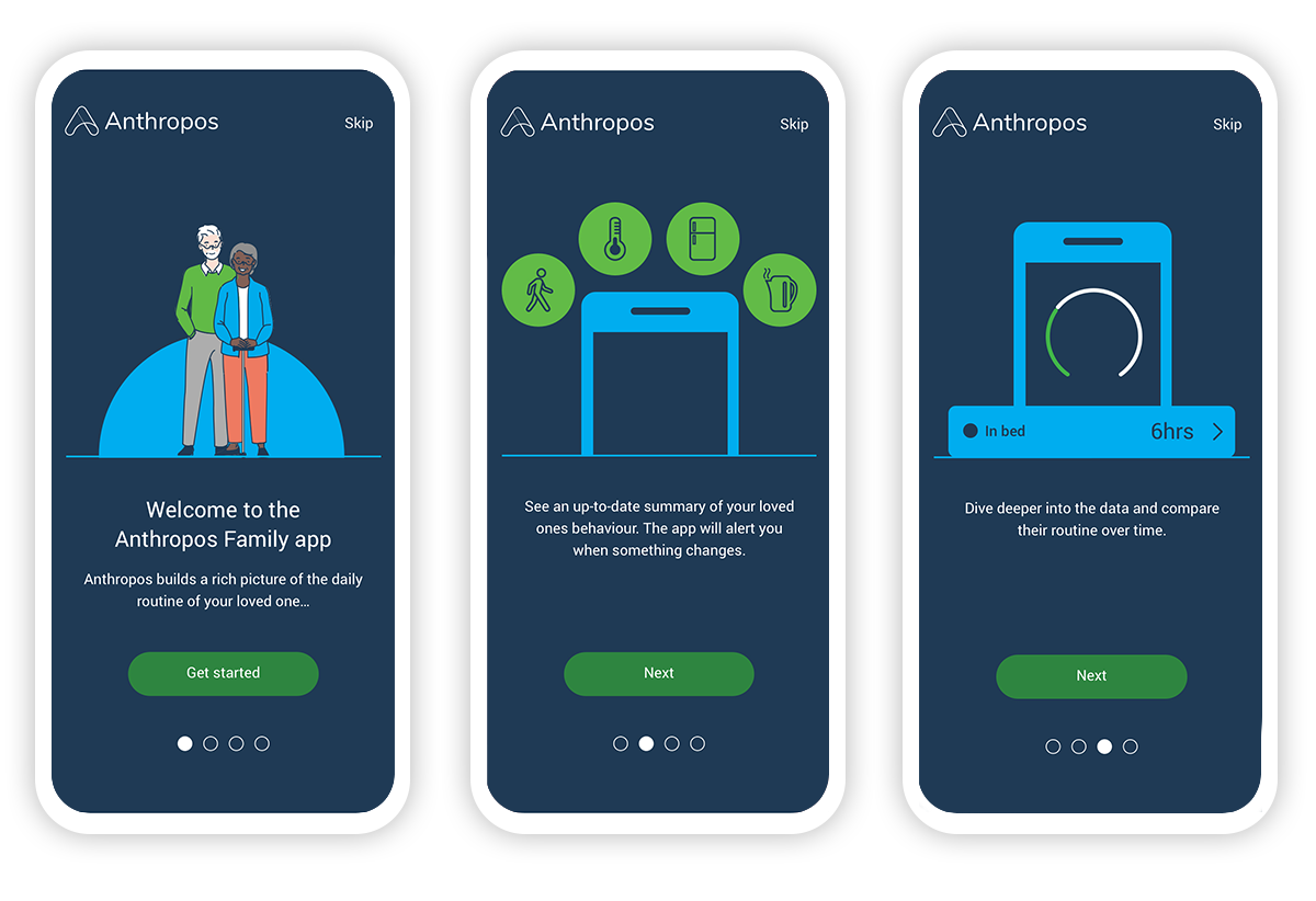
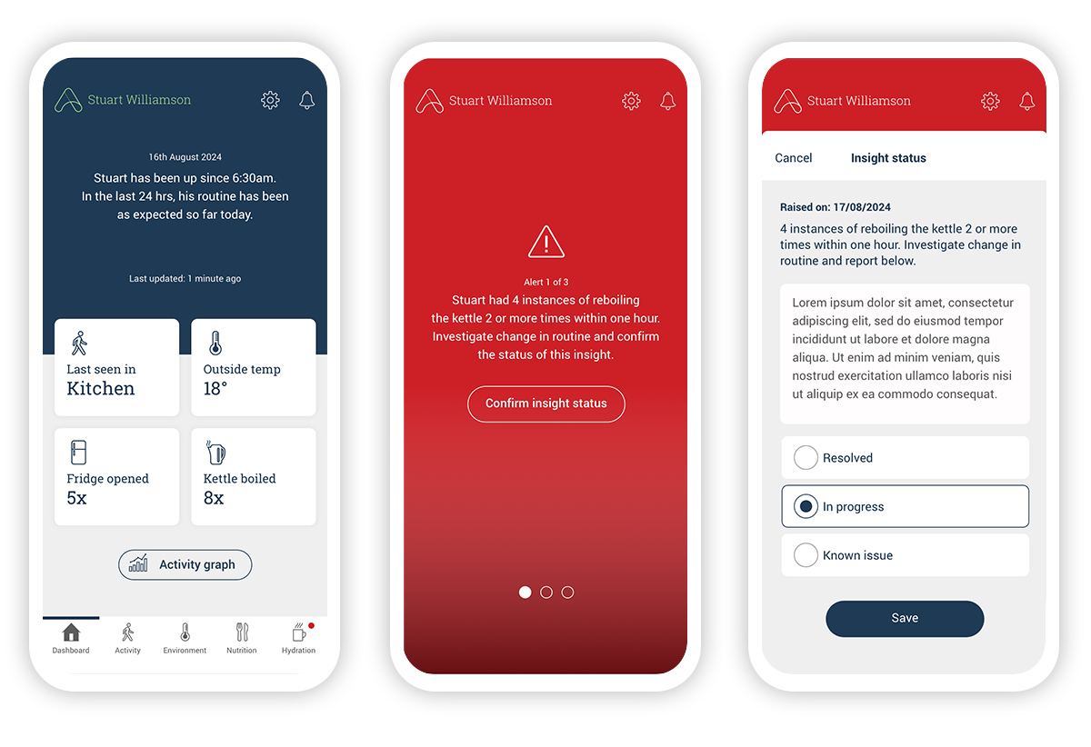
A new onboarding flow leads on to the home screen, which was designed to be a personalised dashboard. A concise, high-level summary of the individual’s wellbeing. It shows updates from each sensor type and provides quick access to more detailed data. By writing in a warm, conversational tone and showing only what matters at a glance, we gave users peace of mind without cognitive overload. We also elected to go for a full screen alert message, which cannot be dismissed. This deliberately forces the user to take action, if only to confirm that all is OK.


Intuitive data visualisation
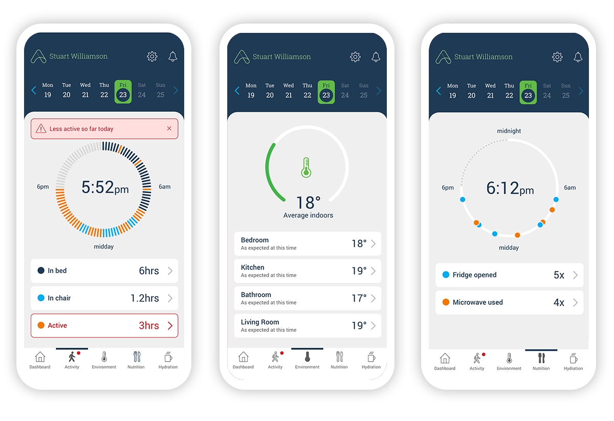
The challenge was to present sensor data along a 24-hour timeline, clearly highlighting any abnormal patterns. But just as important was knowing when not to show too much. Research confirmed that users didn’t want to constantly check in, they wanted to be notified when something stood out. The UI now reflects that balance: minimal when everything’s fine, proactive when something changes.
Several design variations were tested with real users, and their feedback directly shaped the final experience, ensuring the app was not only functional but empathetic to the realities of caregiving.

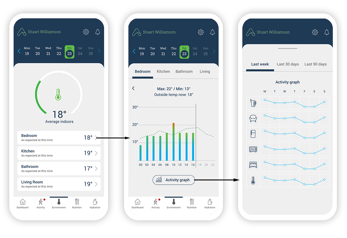
Using progressive discloure to drill down into more granular data.

Outcomes
The redesign of the Anthropos Pro app transformed it from a complex, desktop-centric interface into a mobile-first, user-friendly platform tailored for non-technical carers.
By rethinking the information architecture and prioritizing clarity, the new design offered a coherent dashboard that presented only essential information, reducing cognitive overload and improving accessibility.
Empathetic language and simplified interactions made the experience more approachable, helping carers monitor vulnerable individuals with greater confidence and ease.
