Case Study.
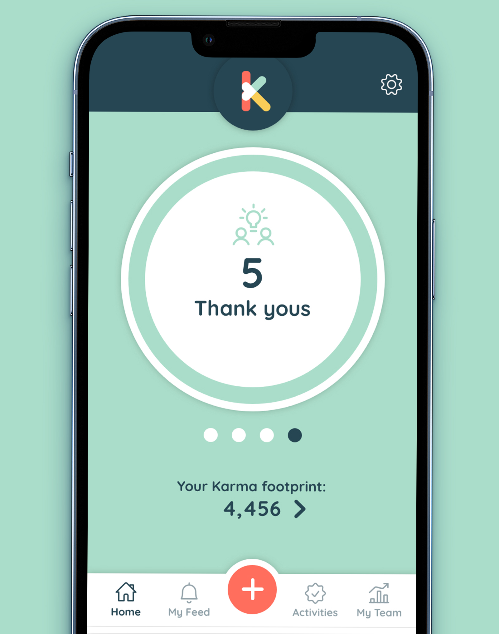
KarmaPact help employers connect with their employees through social, community and environmental programs. This allows companies to embrace and engage with their workforce, while enabling employees to be part of the changes they care about.
My Role
Reporting directly to stakeholders, I led the brand identity design and acted as lead product designer for the app. Part of a global team (spread across the USA, India, France and the UK) I was responsible for the visual design of the entire product. We followed Lean UX and Agile principles to scope and launch a brand new digital offering at pace, during a global pandemic.
Discover.
Identify users and product purpose.
Define.
MVP scope, userflows, sketches & wireframes.
Design.
Brand Identity design and product UI design.
Validate.
Review feedback from trial to build roadmap.
Brand Identity Design
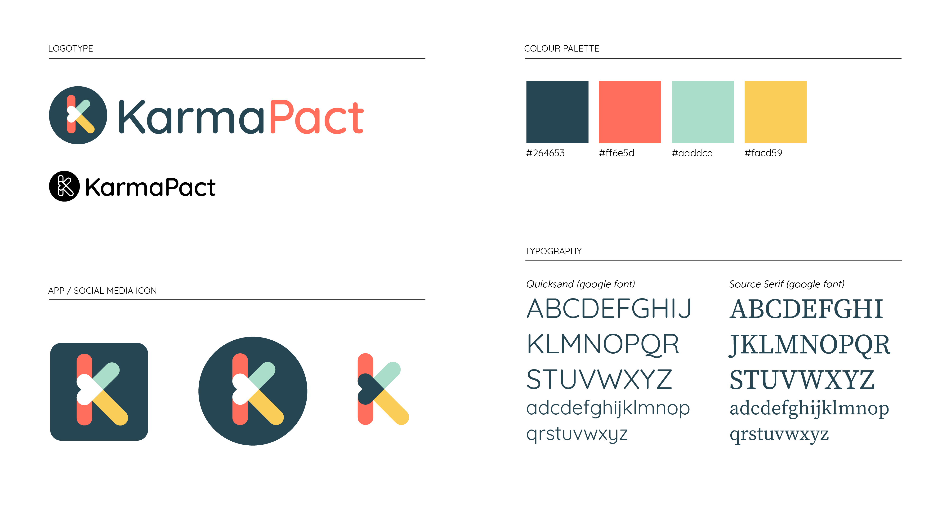
The brand identity was designed with a vibrant, but accessible colour palette that really allowed us to breathe life into the UI design.
The chosen logo represents the three types of activities that users can upload in order to engage with their colleagues:
• Donations
• Volunteering
• Support.
The strong visual language supports the story and purpose of KarmaPact and is extremely important when launching a new brand and product. Any start up needs to hit the market with a professional brand identity so they can approach prospects with confidence and KarmaPact are no exception.


Collaboration was essential because the team is truly global. The stakeholders are based in the USA and France, the development team is based in India and I’m working from the UK. For that reason we chose to work in an agile way, breaking the scope down to user stories and running regular ideation sessions, workshops and retrospectives.
I clearly scoped and explained features by mapping out userflows and creating detailed annotated presentations. This allowed us to collaborate as a team, with early stage feedback.
This flow of information kept the project going at pace, despite the differing time-zones and languages. Complex flows and detailed interactions were built using Anima and Principle, to compliment the static Sketch files.
UI Design
Identifying and expressing the purpose of the app, as well as it’s intended users is fundamental to the way it is designed. I was also conscious of time and budget constraints which led us to adopt material design principles. This saved time and gave us a library of proven styles and components to work from.
UI Design
Identifying and expressing the purpose of the app, as well as it’s intended users is fundamental to the way it is designed. I was also conscious of time and budget constraints which led us to adopt material design principles. This saved time and gave us a library of proven styles to work from.
Adding an activity
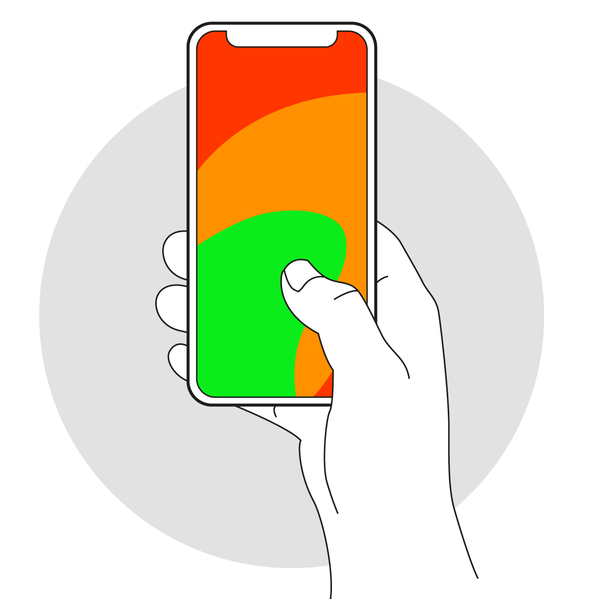
For KarmaPact, we wanted to make engagement frictionless. A recent study showed that 85% of people use their thumb to navigate apps, and 49% operate their phone with one hand.
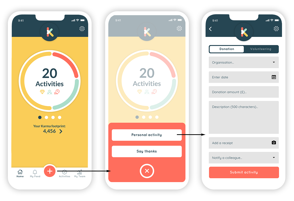
To allow users to add new activities quickly and easily, I designed the ‘+’ so that it was in a prominent position and available on every screen. It is positioned so the user can easily reach it with their thumb whilst holding their mobile device.

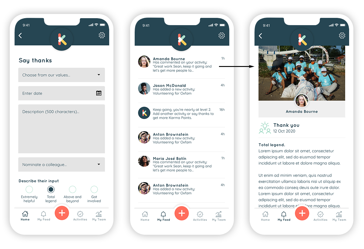
Showing support
Engagement and connection is at the core of what KarmaPact is all about. Showing support, saying thank you and getting involved with colleagues is a huge part of bringing people together.

Gamifying the experience
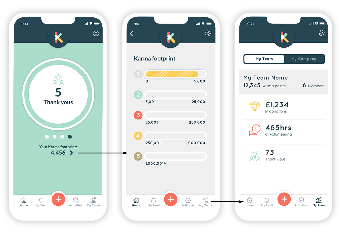
Initially we had planned to generate a score from the users activities in order to create competition within the teams and gamify the experience. However, initial feedback from test users highlighted that this wasn’t in keeping with the purpose of the app. People don’t do charitable work in order to shout about it or score points. Instead, we had another look at this and created a personal ‘Karma footprint’. This isn’t shared with other users, but it can be used as a rewards scheme that the employees organisation manages.

Outcomes and results
The KarmaPact team have been able to put a tangible and credible product into the hands of some large organisations’ employees. They are trialling the app and are actively involved in helping us to refine it, because they want to be part of it’s success.
The next phase for us, is to consolidate this feedback into a roadmap and launch the product to a wider audience. Along the way we’ve learned how working remotely can be an isolating and sometimes lonely experience. Regular collaboration, updates and demos (no matter how small) brings the team back together and gets us talking and focussed again. This has been a key part of this experience for me. Better things happen when you work as a team.
