Lean Experiment
There are times as a UX/UI designer, where I already have a solution in mind for the problem I’ve been tasked to fix. So when I want to simply test a theory as part of the Lean UX process, I like to follow the Lean Experiment Map.
This process allows me to test and measure the potential of a new design and present back to the team and stakeholders. The point of this process is to formulate a hypothesis, run an experiment, measure the results and if necessary, re-run the experiment until the desired result is achieved.
So here’s how I ran this experiment at NewDay against a KPI to reduce call centre traffic and encourage customers to use the self-help tools:
Hypothesis.
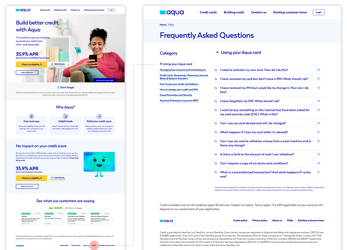
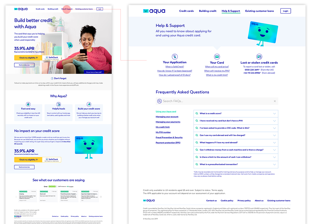
New customers rely on the call centre because they cannot easily find the information they need on the website. Re-purposing the hidden FAQ page, renaming it ‘Help & Support’ and moving it into the main menu will enable visitors to ‘self-help’ and reduce calls to the call centre.
Experiment.
Show participants the current live FAQ solution and then the proposed Help & Support solution. Ask them to imagine they are looking to find information on when their PIN number will arrive. Run two basic usability tests for control (an A/B and a B/A test)
Existing FAQ solution tested:

Task completion
Av time to find the answer: 2m 32s
Difficult
How easy was it to find the answer to your query?
Confident
How confident where you that you had found the correct page, before clicking on it?
New Help & Support solution tested:

Task completion
Av time to find the answer: 46s
Easy
How easy was it to find the answer to your query?
Confident
How confident where you that you had found the correct page, before clicking on it?
Results.
The Help & Support variant performed better overall. It took users less time and less clicks to find the answer to the query presented to them at the beginning of the user test.
Why?
Because users understand ‘Help & Support’ and although a few participants spoke in the think out loud test about looking for an FAQ section, they mentioned it was hard to find. The new Help & Support page is designed to signpost users to the most commonly asked questions.
Insight.
Making it easy for customers to self-help through the website for basic queries should reduce the stress on the call centre. But it needs to be clearly signposted, more prominently positioned and the page itself needs to be better designed.
Next steps.
Re-purpose FAQ into a Help & Support page and move it into the main navigation. Review and refine the design and content for this page in conjunction with insights from speech analytics.
Launch and test.
Lean UX process
Read how I use the Lean UX process to highlight a problem, develop a theory and design solutions that result in successful outcomes.


