Case Study.
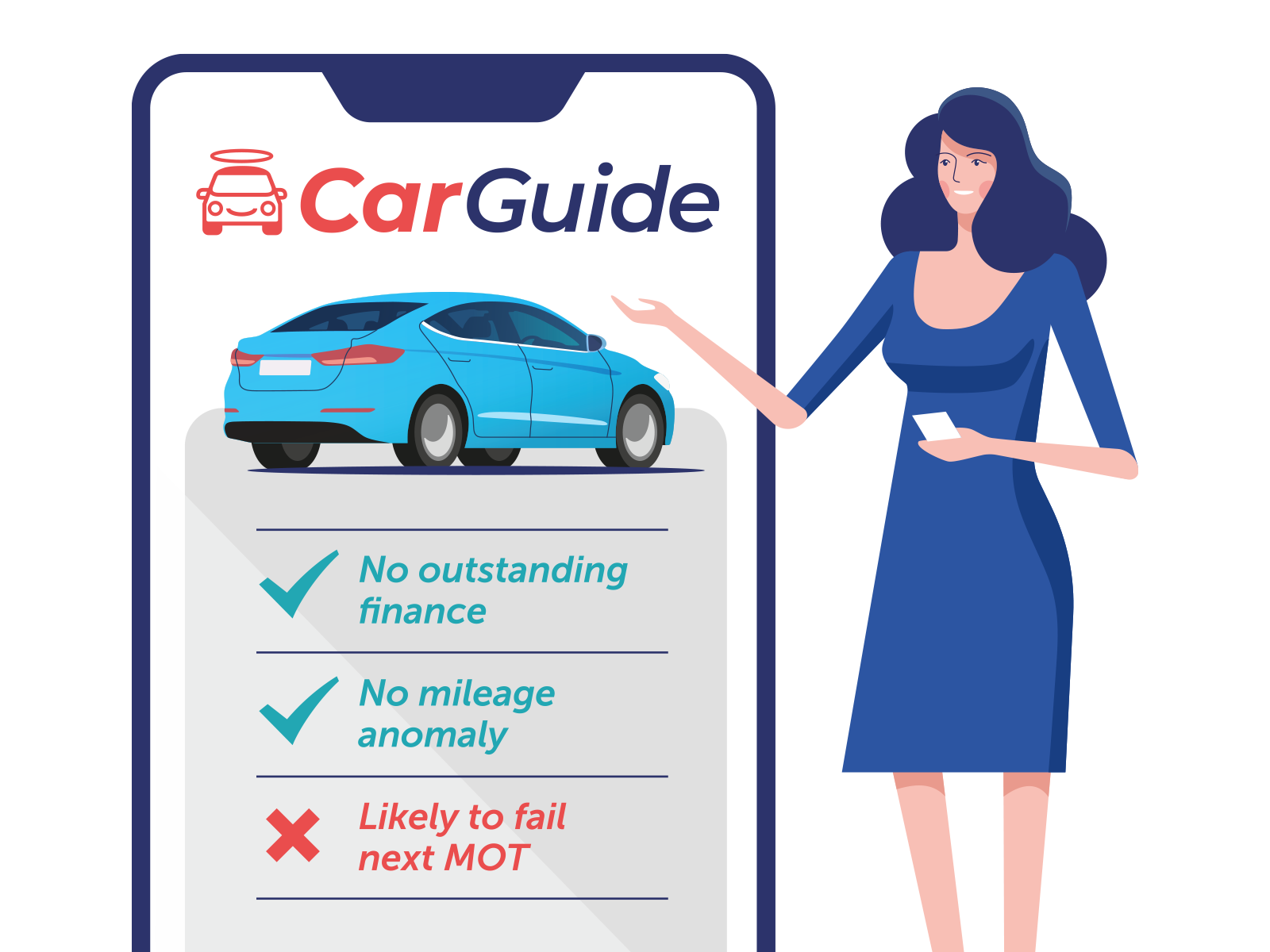
CarGuide is a start-up that exists to help and guide all used car buyers. It gathers vital information about the used car(s) you are considering and presents that back to you along with an assessment of the vehicle and key questions you should ask the seller.
My Role
Collaborating with the founders and working alongside a remote team of developers, I led the design of the brand identity, product definition, user experience and final visual design of CarGuide. As part of the process, I took the team through the Lean UX methodology and cherry-picked the appropriate activities for this project.
Discover.
Ideation workshop, personas, user stories, business stories.
Define.
Userflows, sketches, prototype & wireframes, user testing.
Design.
Brand identity design, UI design, design system, collaborate with developers.
Validate.
Gather data throughout the project to iterate design.
Discover
Firstly, I ran an ideation workshop to help stakeholders define the overall value proposition for CarGuide. A huge amount of data can be gathered for each vehicle, but what is actually valuable to the user?
By encouraging the business to bring users to life with personas, we can understand (or at least make some assumptions) around their motivations. That helped us to decide how much (and what) data to display to both petrolheads and less experienced used car buyers.
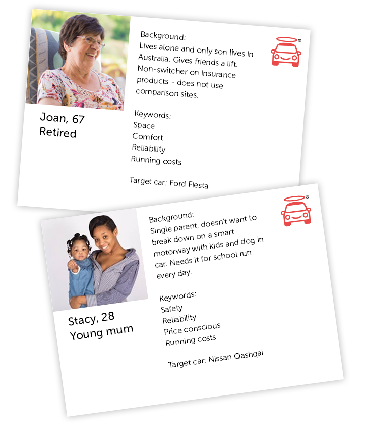
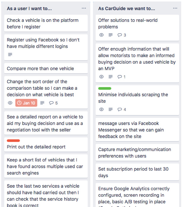
We collaborated remotely on card sort sessions to define the MVP. By creating user stories, we could reference the personas to validate that the MVP functionality met all of their needs. We also set the business needs alongside these.
Creating these cards in Trello, meant that the whole team could contribute, comment and add their own user story. In effect, we were developing the functional spec of the product.
Whilst we were focussed on the customer needs, it’s also important to remember the business goals and objectives and aim to balance the two.
Define
Userflows
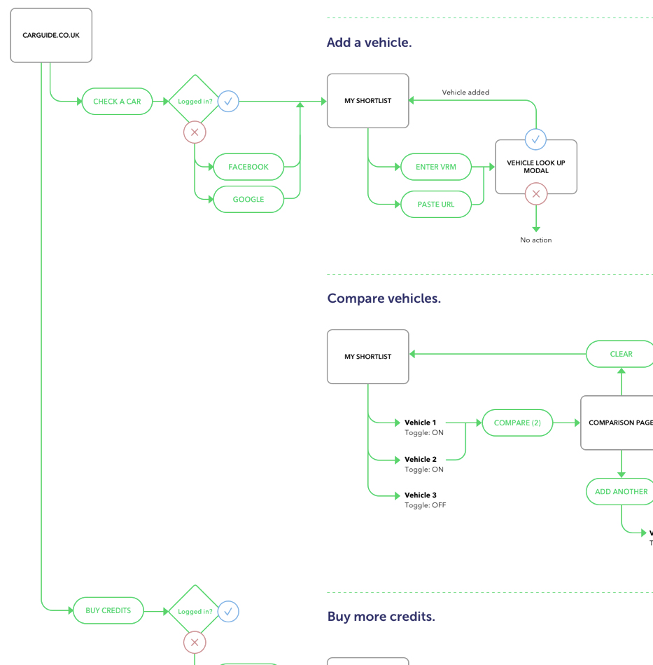
I started the define stage by generating userflows to describe and optimise the paths taken for users to perform the key tasks within the site: Add a vehicle / Compare saved vehicles / Buy credits / Buy a report.
Userflows allowed us to focus on the users experience and not the design details on the screen. A flow should show the number of decisions required to perform a certain task. It therefore shows us where we can optimise the journey and reduce friction for the user.
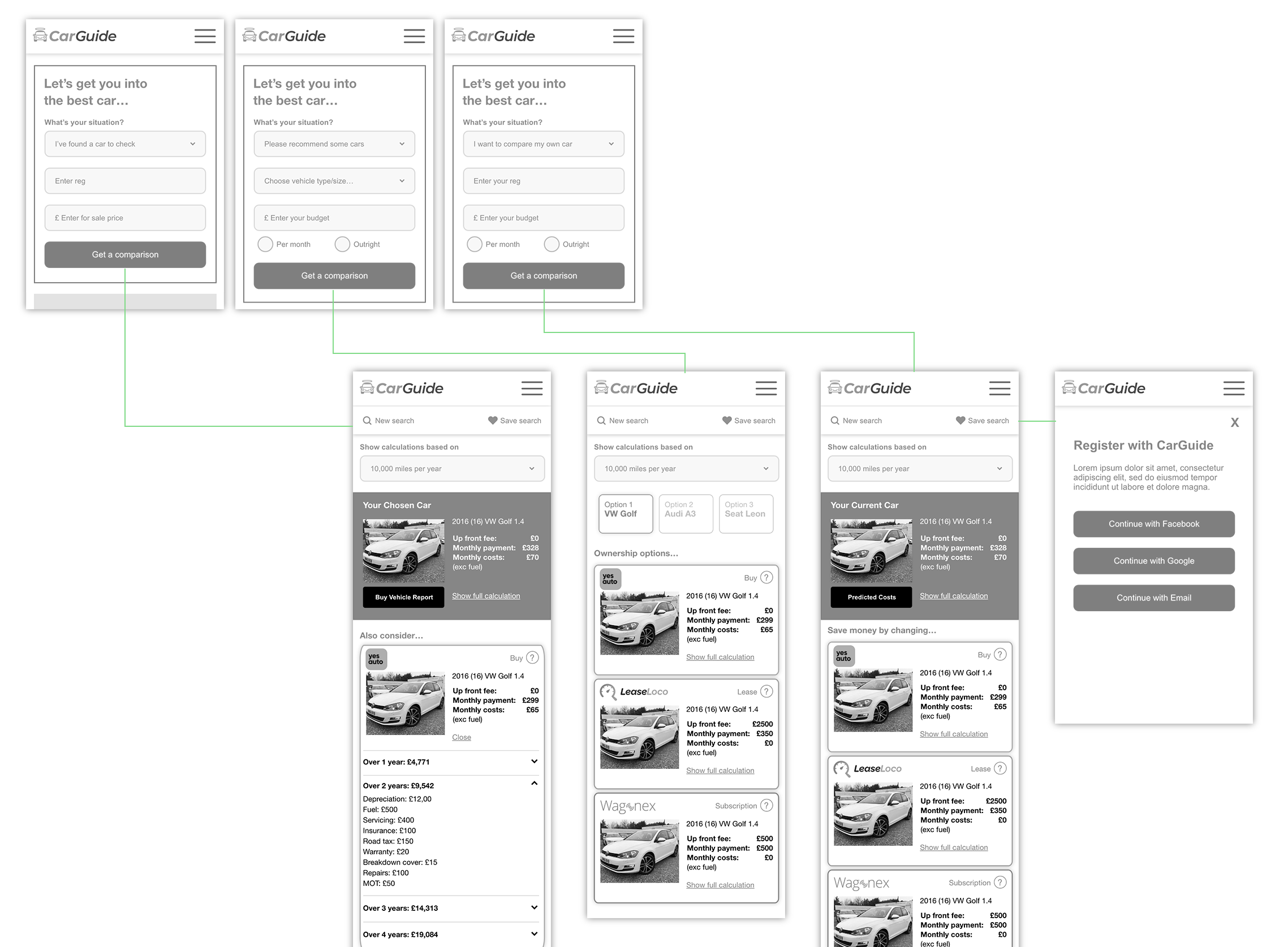
Interactive wireframes.
Next, I created interactive wireframes in Adobe XD, to better understand the userflows and to start to bring the solution to life. These are extrememly useful for early user testing and A/B testing of key pages (mobile-first). We conducted a live test in order to gain feedback on the following:
• The overall proposition
• Value (cost per report)
• Usability and intuitiveness
• Tone of voice
Design
Brand Identity.
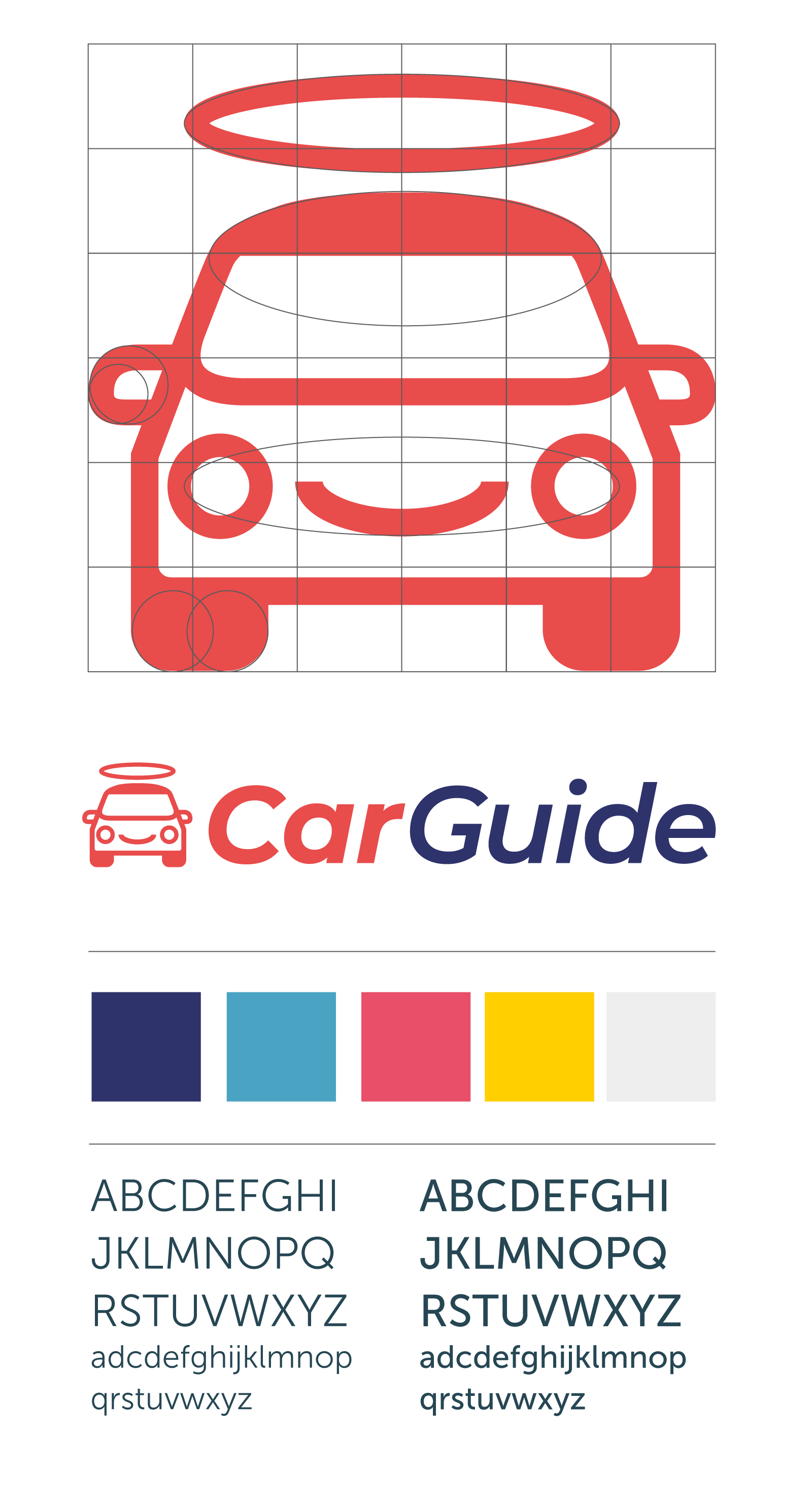
I designed a brand identity that gives CarGuide a personality to fit with their brand values: “A friendly guide helping motorists every step during the used car buying cycle, helping them to make the right decision, avoiding unnecessary trips to view dodgy cars”.
The smiley ‘saintly’ car logo was created to give CarGuide a device which can be used on social media channels and throughout the website as a visual guide.
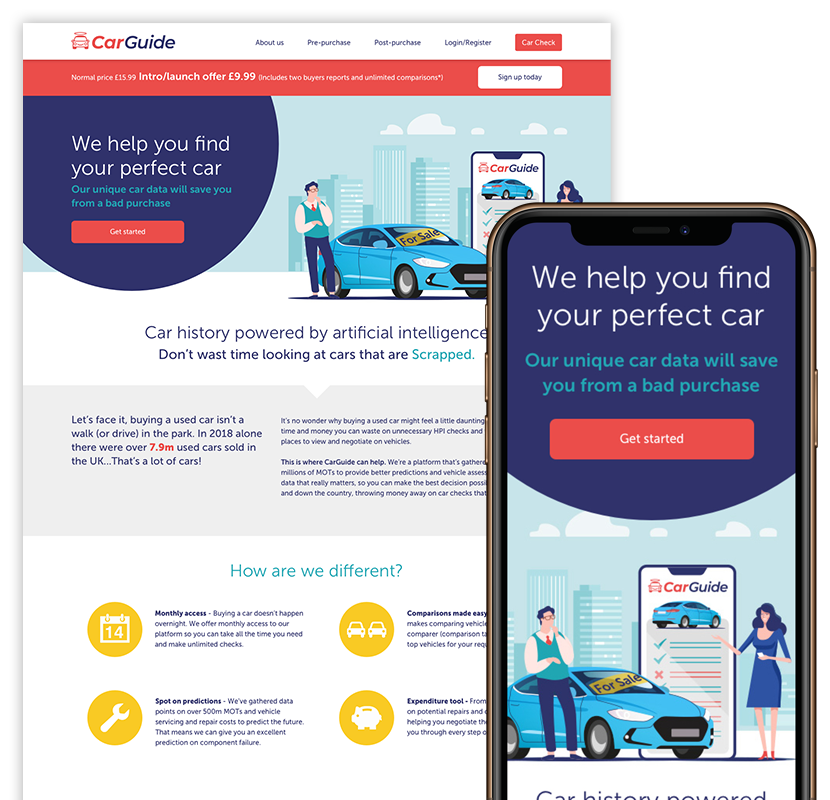
Launch Website
The launch website introduced users to the CarGuide proposition and brand for the first time. It was important that we had clear messaging and brand guidelines to follow, so that their first impressions would be positive.
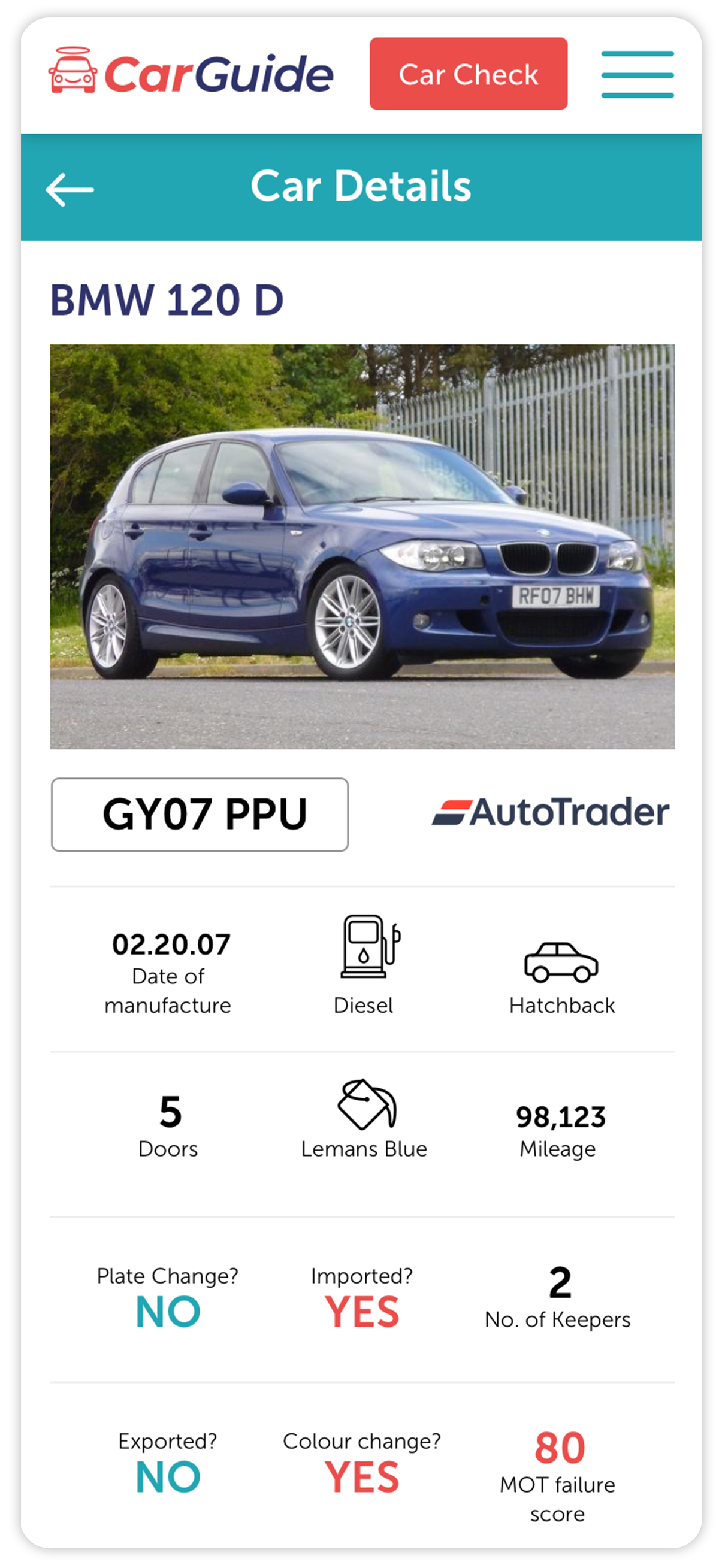
UI Design
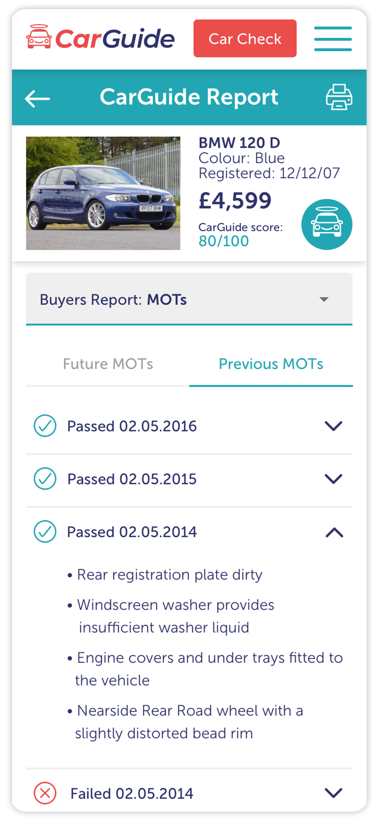
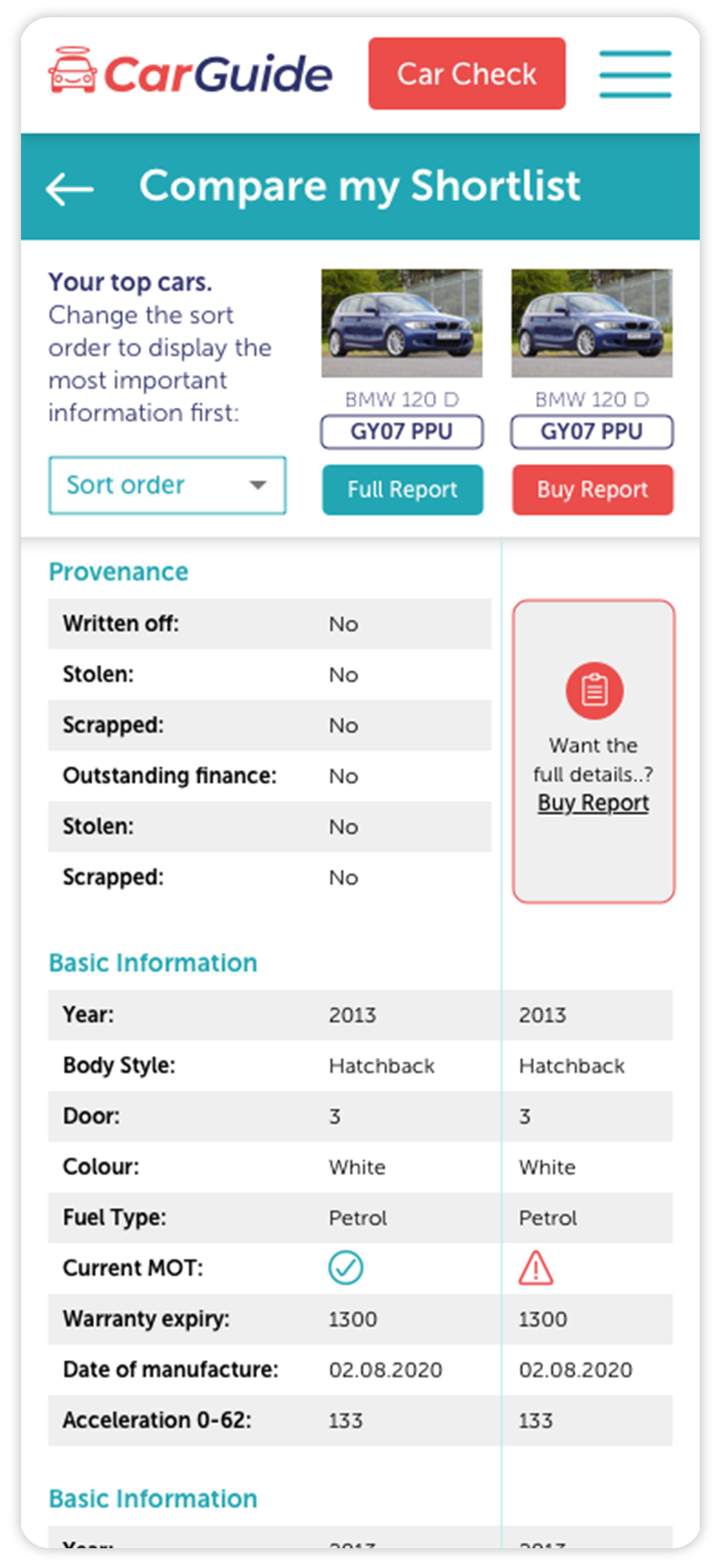
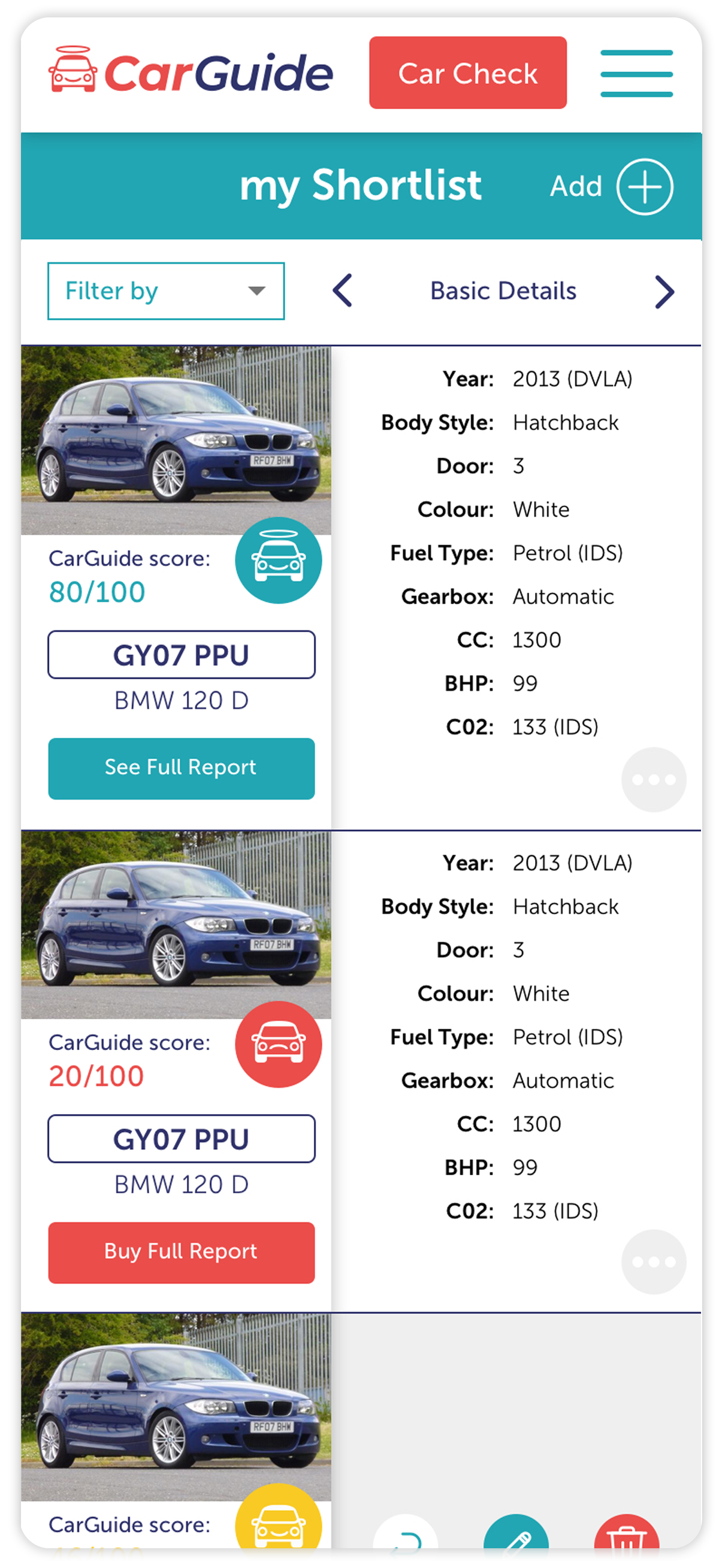
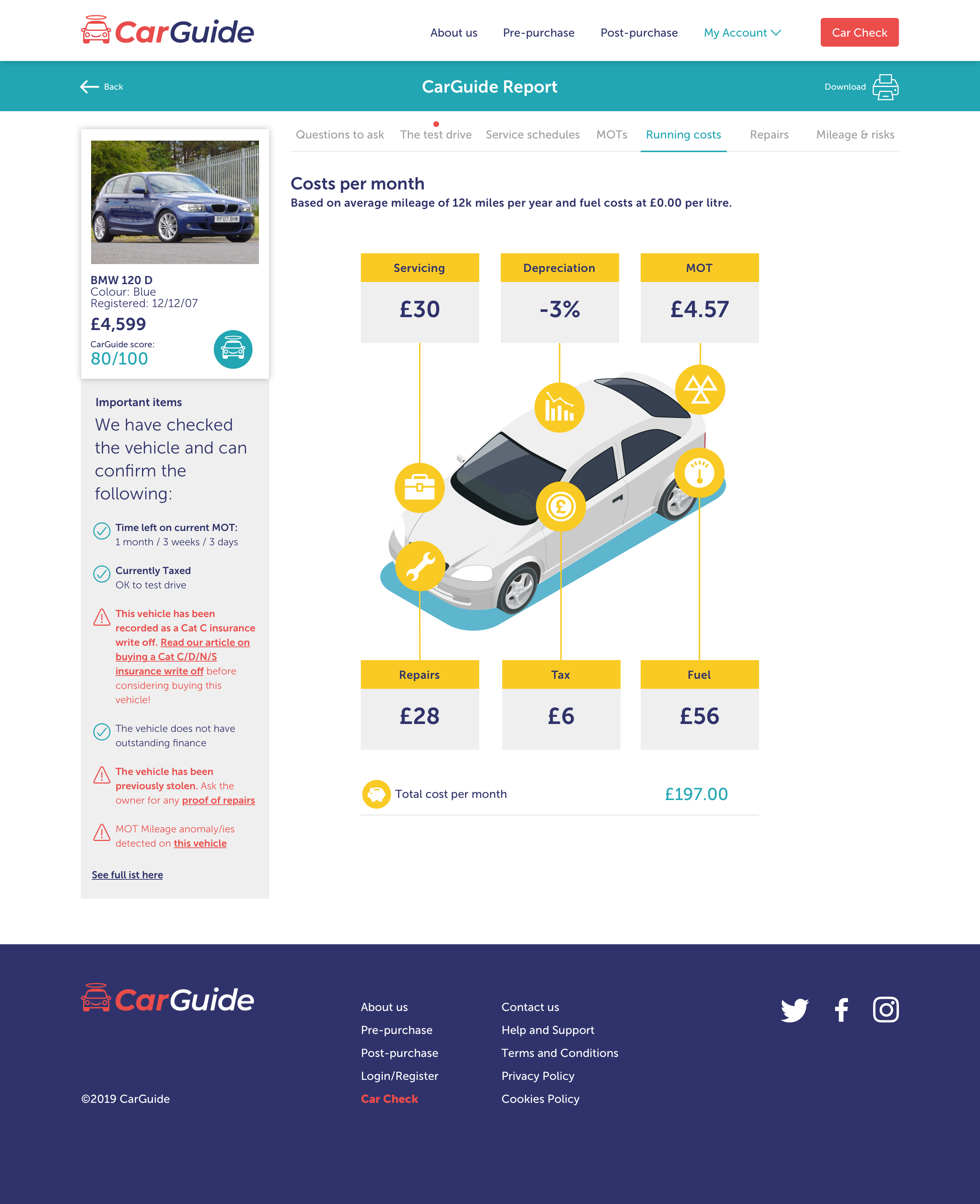
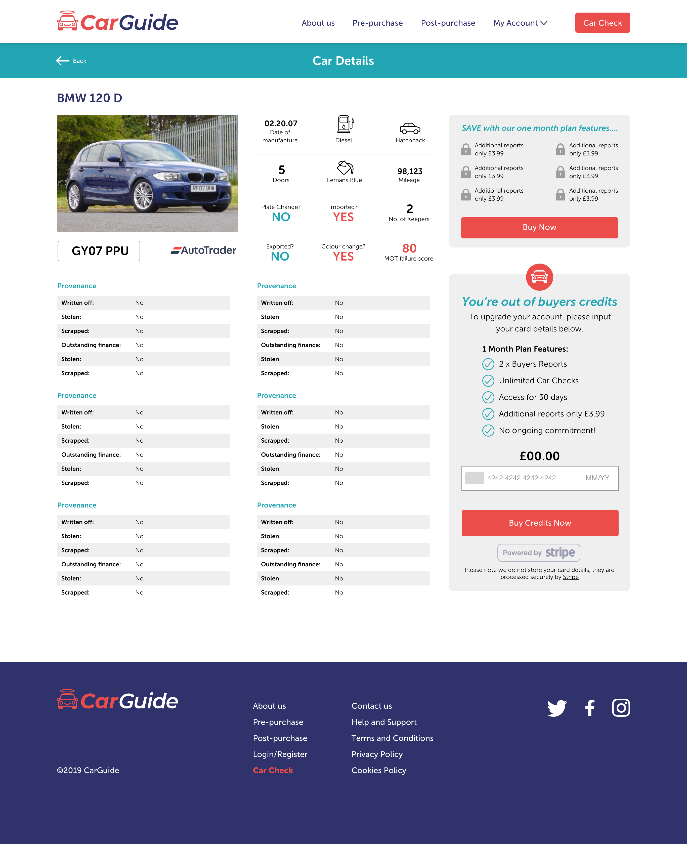
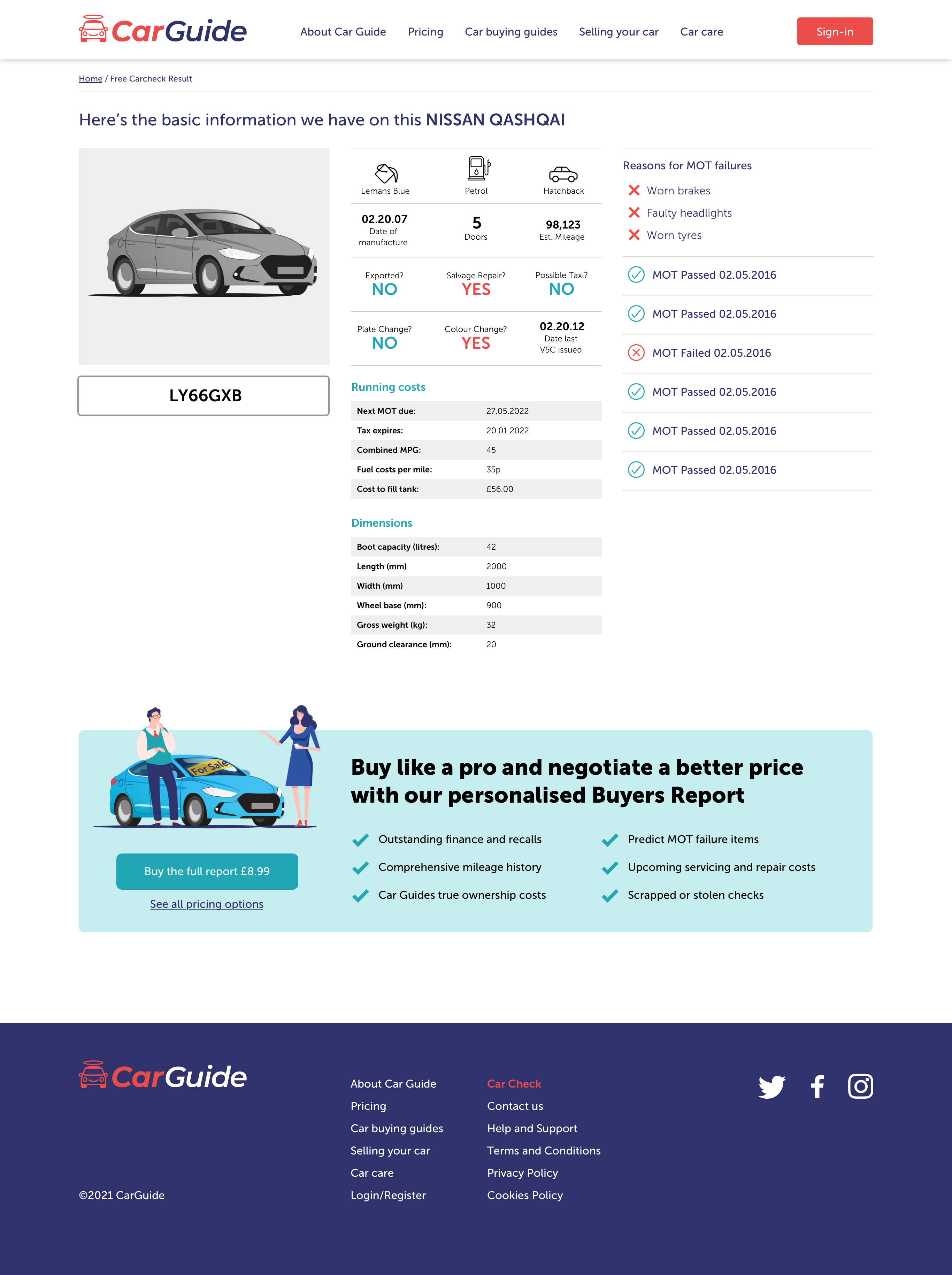
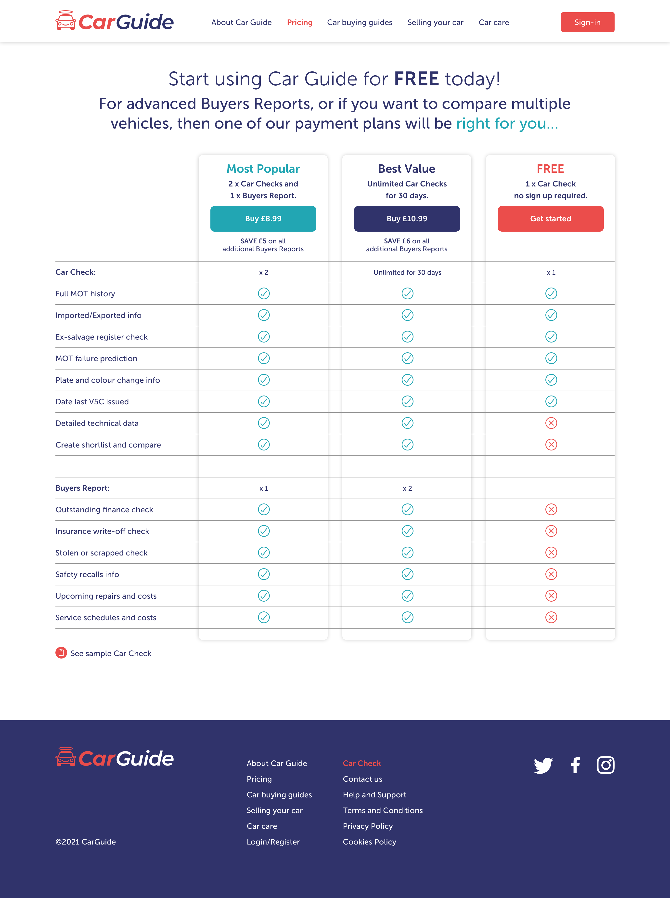
With the style now set in place, I could design the functional pages that were created during the ‘define’ stage. I adopted a mobile-first approach to design as we had identified this would be the main use case for CarGuide.
Together, we explored UX solutions for the detailed report pages and key functionality such as ‘Compare favourites’ ‘Buy Credits’ and the ‘Buy Report’ journey.
Design system
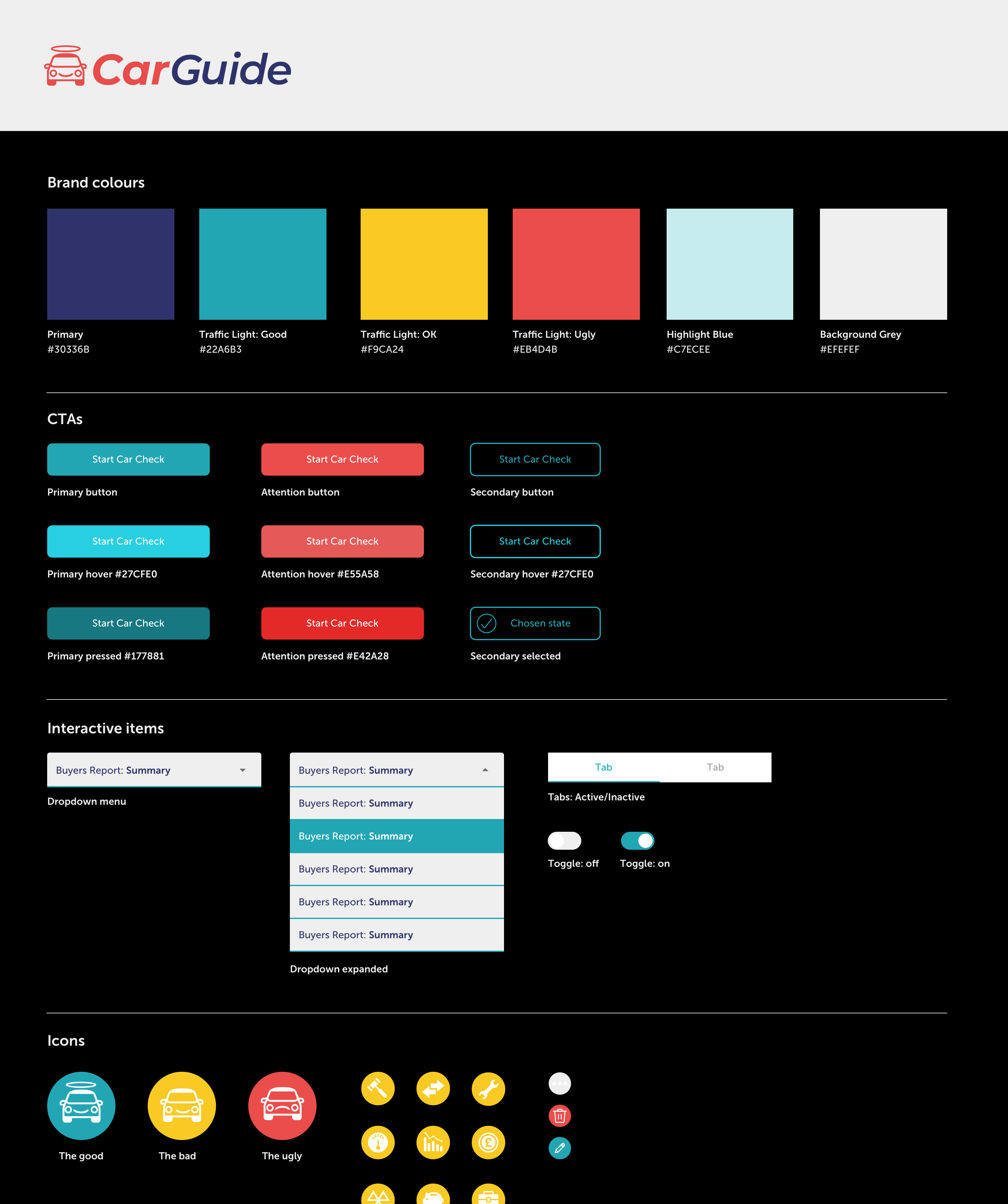
To enable CarGuide to iterate and introduce new features, each of the elements are archived into a library or design system. This system is an important tool to ensure that the established design is maintained, going forward. By creating the design system in Sketch, developers can access and inspect all the elements using Zeplin.
Results
The CarGuide MVP was launched during lockdown and is now providing 1000+ buyers reports a month to UK motorists. Established businesses are also integrating their unique vehicle data API into their platforms. The team will build on this success and together we continue to develop and refine the product.
