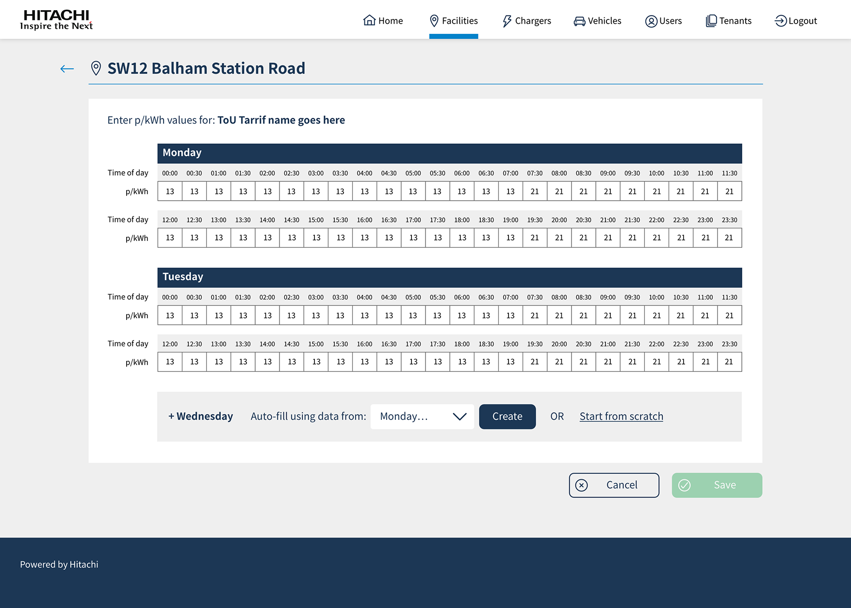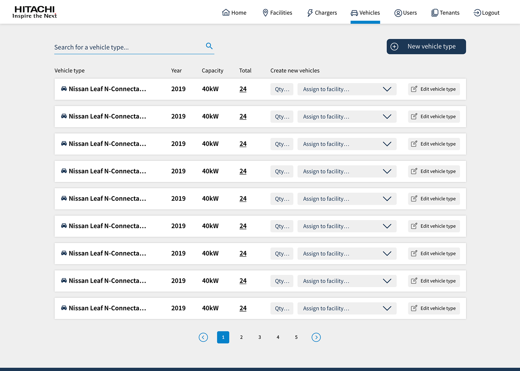
Case Study.
Hitach Social Innovation, is a division of Hitachi focussing on initiatives to drive change. This project supports their efforts to reduce and manage the energy usage of large organisations. It focusses on tools to give organisations insights into their facilities, allowing them to reduce energy consumption and transition to EV vehicles as part of their fleet decorbonisation goals.
My Role.
Lead Digital Product Designer. I guided the team in transforming their specification document from a ‘wish list’ to a final product. Using a tried and trusted design process to validate assumptions along the way and tailor our design decisions more closely to user needs.
Discover.
Turn specifications into user-stories. Define the product value proposition.
Define.
IA, userflows, interactive prototypes. User test with audience.
Design.
Final UI design, User test with stakeholders, data visualisation, tokenised design system.
Validate.
Continuous validation, lightweight research, including lean experiments.
Discover
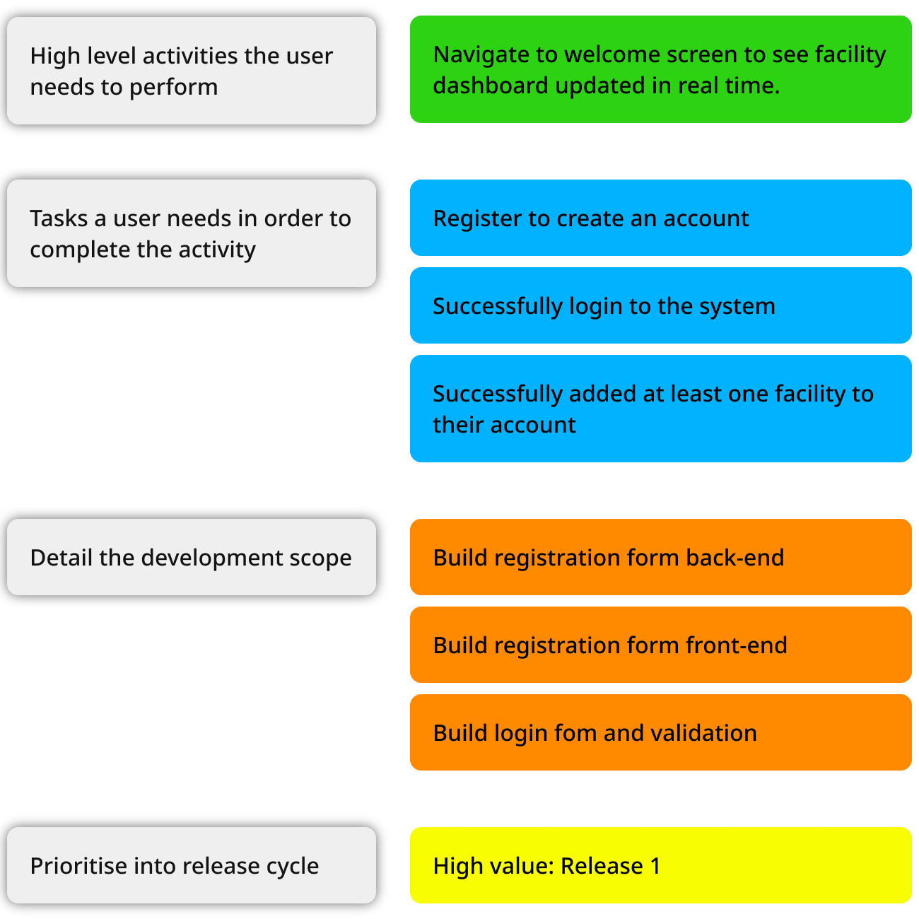
I advocate for launching small but useful features with a strategy for growing the product. I helped the team convert their requirements into user stories by breaking them down into more detail.
We scored each feature by value, confidence and effort in order for the Product Manger to prioritise the product roadmap and release cycles. It also enabled the engineering team to identify parts of the product that can be built without the need for design, such as fundamental back-end services.
Example: what do we need to do in order for the user to navigate to the dashboard.
We established a clear product value proposition, defining the target audience, the product’s purpose, and the reasons behind its development. This declaration serves as a crucial reference throughout the project, helping to maintain focus on the core ideas. Without this, there is a risk of losing sight of these essentials amidst the influx of feature requests.
Define
Information Architecture
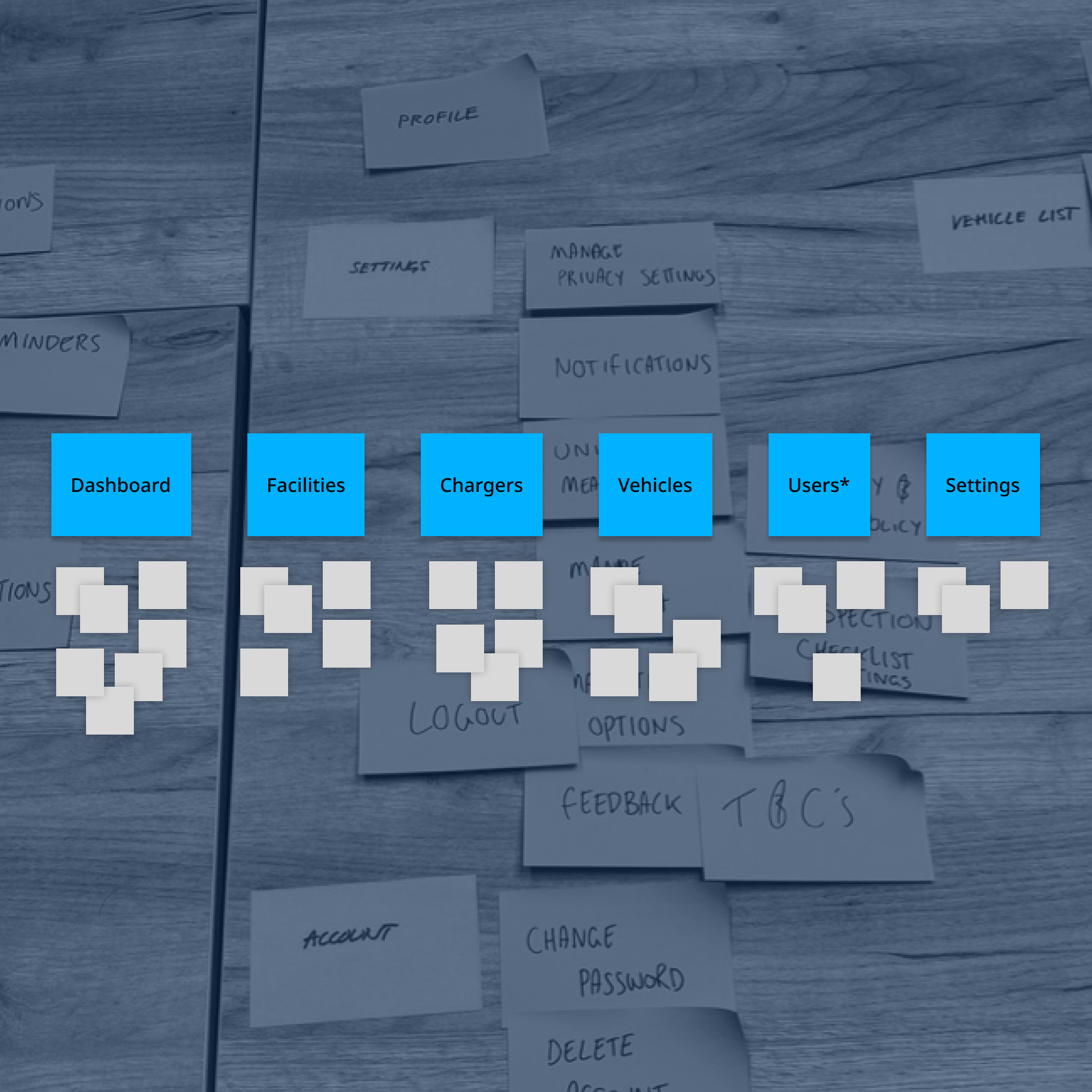
I ran virtual card-sort sessions using Miro to define the Information Architecture.
Taking the product specification from the user stories, we asked beta users and stakeholders to organise content and features into logical sections.
User Journey Maps
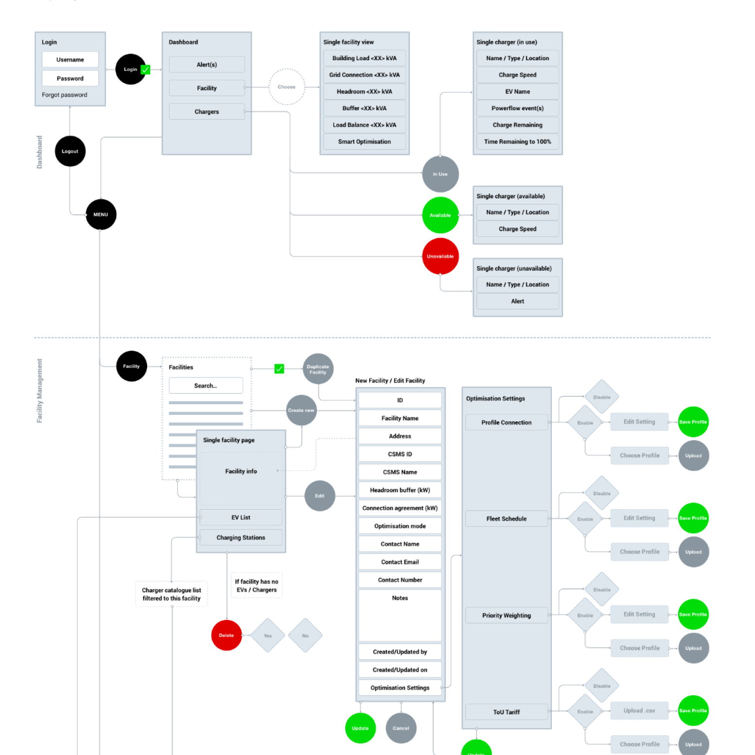
I used these diagrams to illustrate the user experience as they interact with features and tasks, as well as touchpoints across the other brand channels and devices, providing a comprehensive view of their journey.
By highlighting pain points, opportunities, and key moments, the diagram enabled us to optimise their experience in order to meet their needs and expectations.
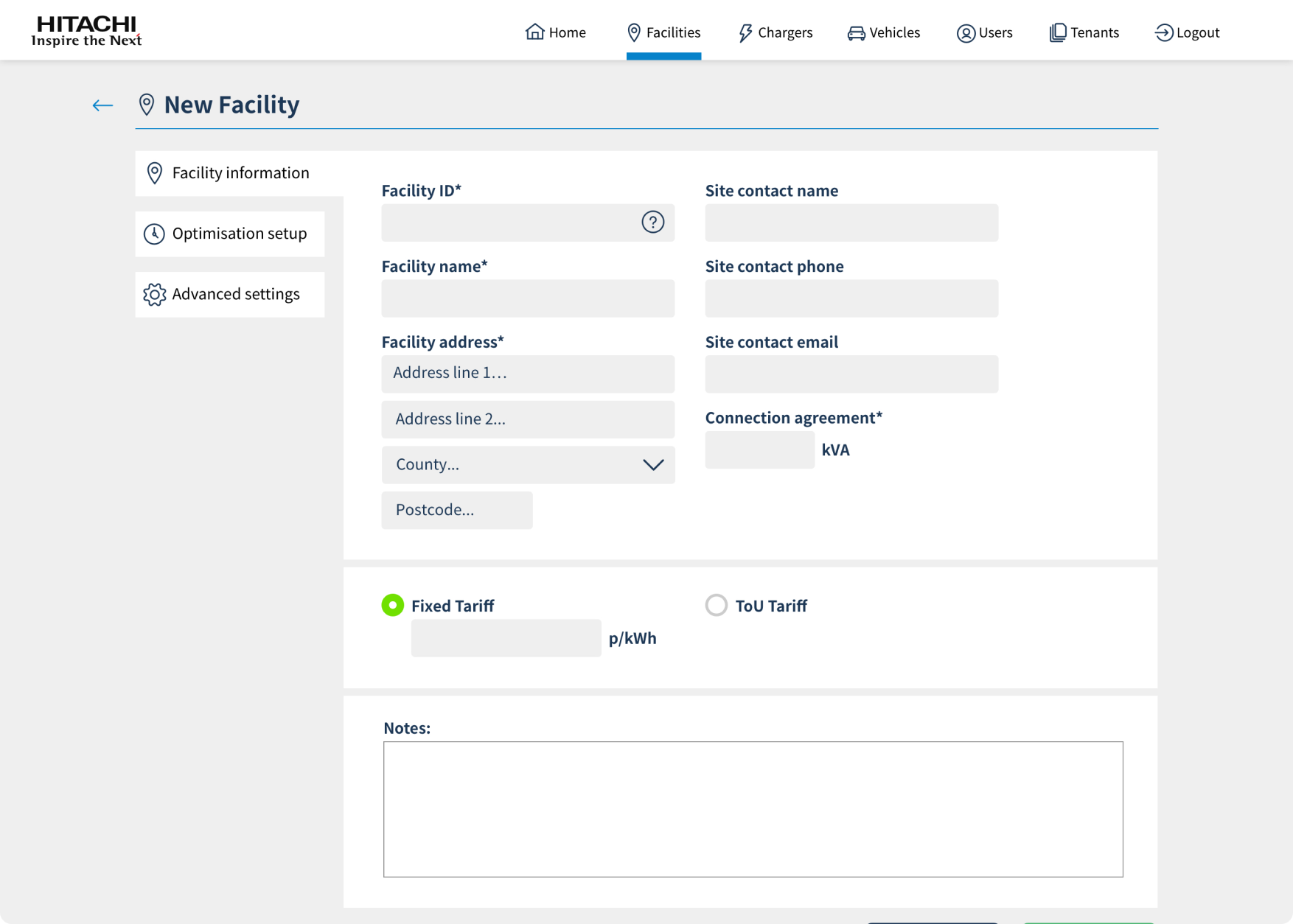
For instance, we realised a pain-point for the user was the amount of information we were asking them to input when setting up a new facility. Instead, we decided to allow the user to input basic information and give them the option to include more, after the facility had been added.
Wireframing and Prototyping
A wireframe diagram is a low-fidelity visual representation of the digital interface. It focuses on usability and alignment with the product value proposition. These were used for early user testing, as well as testing the placement of elements such as buttons, menus and content. Wireframes and prototypes were instrumental in the early stages of the design process, allowing the product team and stakeholders to double-down on the product and quickly iterate before investing time and resources into high-fidelity design and development.
Language and Tone of Voice
We took the opportunity to make sure we were using consistent messaging throughout the product and that we aligned with other Hitachi software products. We asked participants to describe what they expected to find behind each of the navigation pillars.
Data Visualisation
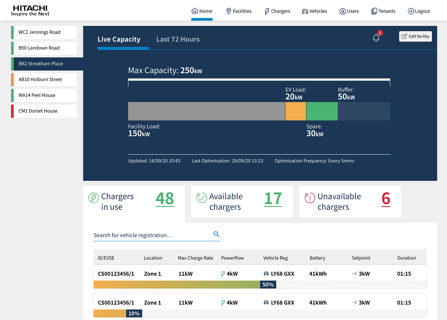
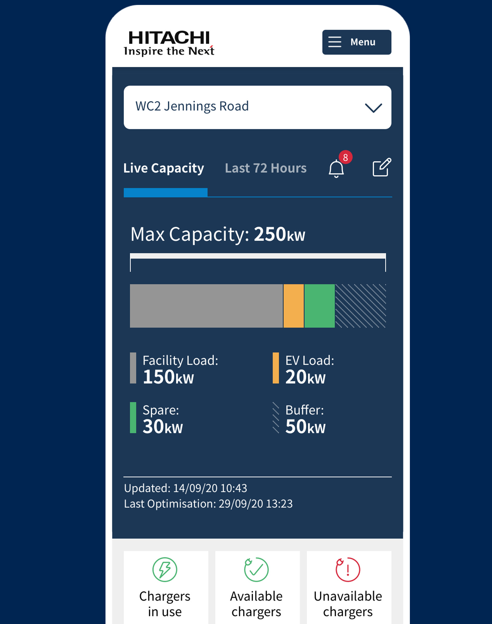
Low-fidelity protoypes allowed us to test various iterations of the facility load graphic. We asked participants to describe what the graphic was telling them. We used this feedback to improve the data visualisation, before the final design.
Task Completion
Does the proposed product align with the value proposition? Can users undertake the most common tasks, without prompting? In their mind, is there anything missing that we can either add now or include in the roadmap?
Design
Agile Delivery
The team worked with the Product Manger to finalise the product roadmap. Referencing the user stories from the ‘Discover’ phase along with any new information gained from user testing the wireframes.
Engineering deliverables were timeboxed into 2 week sprints. Although design works differently, because I have to consider the whole story, I prioritised to align with the roadmap and made sure I was ahead of the next sprint.

UI Design
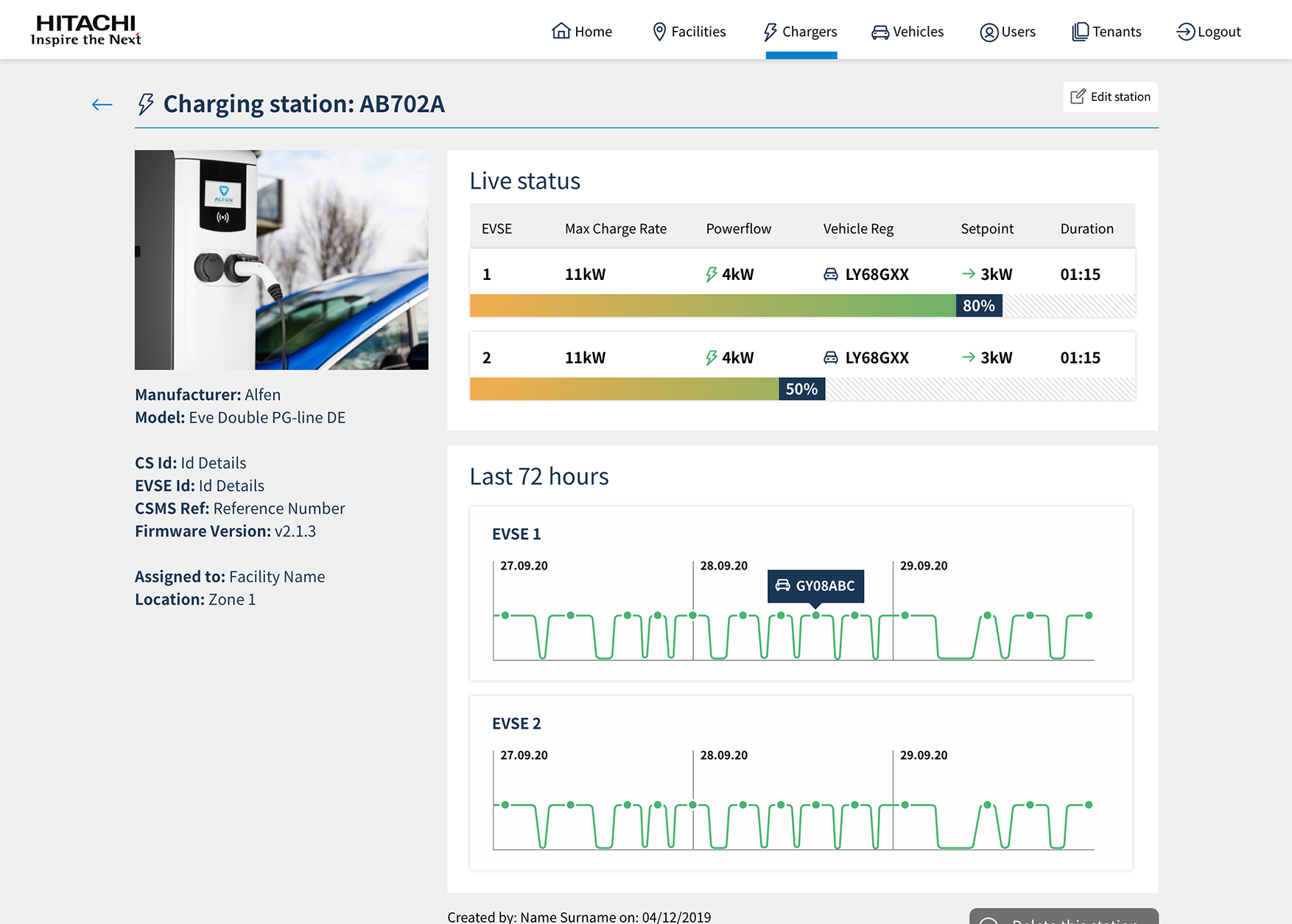
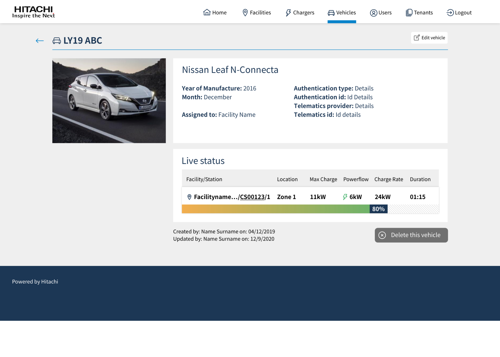
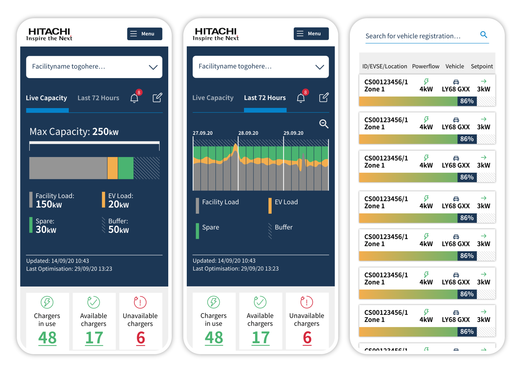
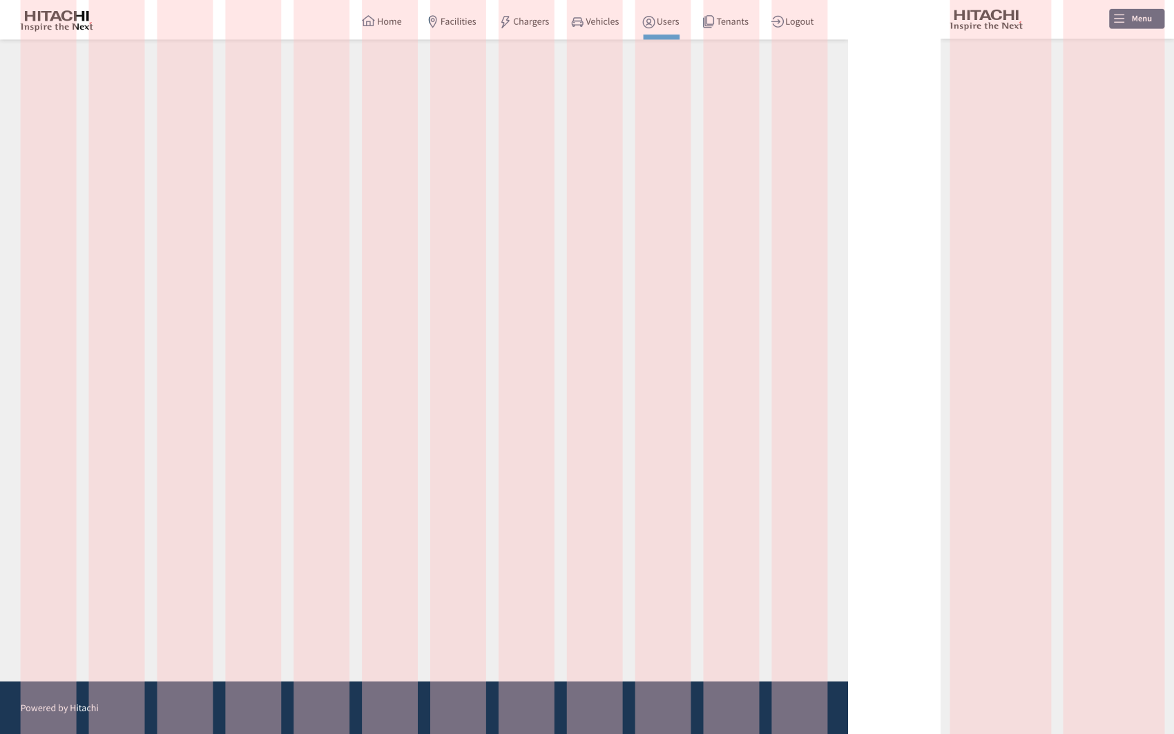
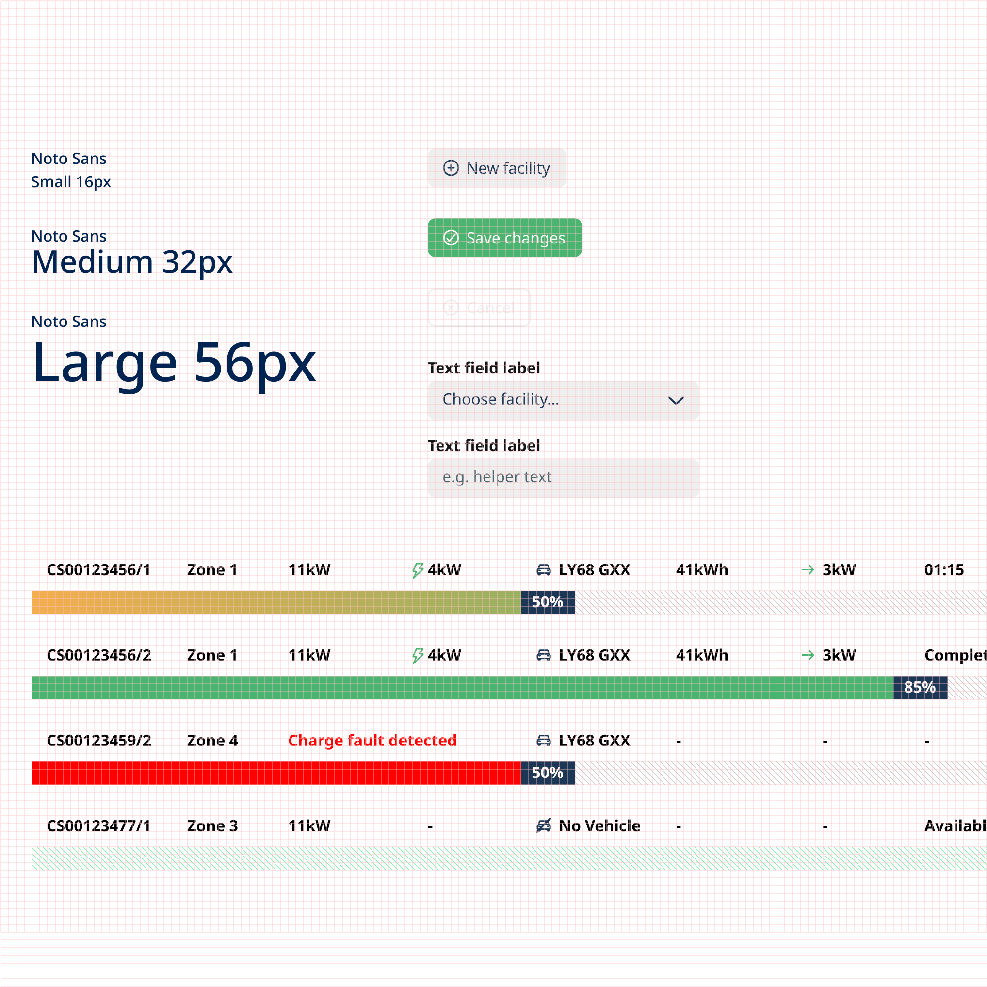
Translating the insights gathered from research into high fidelity UI designs. I focused on crafting a UI design that followed Hitachi’s brand guidelines and AA-AAA accessibility standards. The final design addressed the comments and issues that were experienced with the previous wireframe prototypes. As part of the hand-off, I documented typography and layout styles as well as layout grids, components, interaction patterns, and data visualisation.
Handover Process
Documenting and communicating design decisions eased the handover process, prior to a design system being in place. Layout grids, for instance, serve as a tangible reference that communicate the spatial arrangement of elements, such as buttons, text fields, and images, within the interface.
This enabled developers to accurately translate design concepts into functional code, whilst ensuring consistency and alignment with the intended user experience, minimising discrepancies between design mockups and the final product.
8pt Grid System
I also followed the 8pt grid system when designing styles and components for this product. Adherence to an 8pt grid promotes scalability and adaptability across various screen sizes and devices, ensuring that the design remains cohesive and functional on all platforms. The consistent spacing provided by the grid simplifies the development process, as engineers can translate design specifications more easily, especially if a component has several variants and states.
Overall, the 8pt grid system not only enhances the aesthetic appeal of the design but also streamlines the design-to-development workflow.
Validate
Lean Experiments
Lean experiments offer a systematic and cost-effective approach to validating hypotheses and refining digital products. This iterative process allows for the identification of user needs and preferences early on, facilitating the development of features that resonate with the target audience. Working within the product team to test and review real-world results to confirm if individual features are performing as expected.
Analytics
Quantitive data offers precise, measurable insights into user interactions, engagement metrics, and performance indicators, providing a clear picture of how users interact with the product. It enables teams to track key performance metrics objectively, identify trends, as well as the effectiveness of implemented changes. This data empowers product teams to prioritise features, ultimately driving iterative improvements to the overall user experience.
User Feedback
Through methods like user interviews, surveys, and observational studies, qualitative data uncovers user motivations, preferences and pain points. It enables teams to empathise with users, identify patterns, and make informed decisions to enhance user satisfaction and drive product success. Ultimately, qualitative data complements quantitative analysis, giving a better understanding of how to meet user needs and expectations.
Stakeholder Reviews
Regular internal reviews, ensuring the success and alignment of a digital product with organisational goals. Is the product achieving the desired business goals? Business requirements and focus can change. These reviews serve as opportunities for stakeholders to share new insights, re-confirm the product vision and align on business priorities throughout the product development lifecycle.
Outcomes
I led the end-to-end design of a new digital tool for Hitachi, turning a loose brief into a focused, user-validated MVP. Starting with stakeholder workshops, I defined core user needs and translated them into clear product goals. Through rapid prototyping and testing, I refined the UX and delivered a high-fidelity design that helps organisations manage energy use and plan EV fleet transitions. The result: a launch-ready product that supports smarter, more sustainable operations.
