Aston Martin joined forces with Masters Historic Racing, one of the world’s leading historic race event organisers, to become its official automotive partner. This has allowed Aston Martin to engage with it’s customers through a number of activities, including exclusive events for owners of historic race and road cars.
My Role
I led the design and managed the development of the website. As the Senior UI designer, I advised on the website architecture, built wireframes, designed all layouts and created the e-commerce user journeys. As a team, we collaborated remotely with AMHR’s team in Monaco.
Define
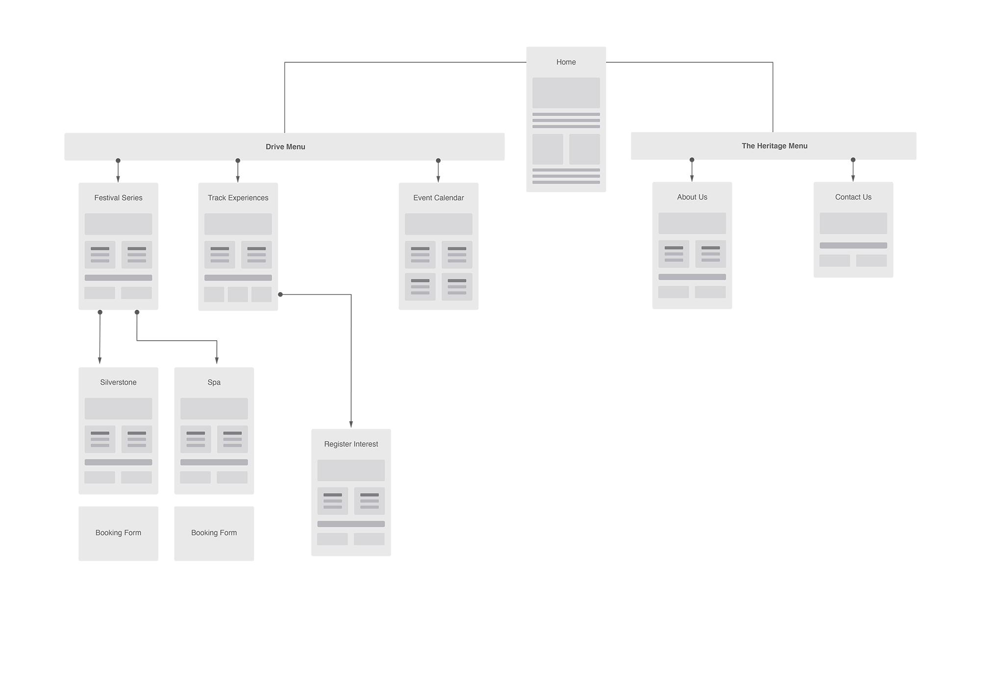
I built a website structure to create a story around this new initiative. I sorted content into two sections – ‘Drive’ and ‘Heritage’ The Drive section connected the user to the unique and exclusive experiences on offer, selling the dream and leading them to the booking forms. Content in the Heritage section played on Aston Martin’s race pedigree and will eventually become a lifestyle blog.
A slight deviation
Once the structure had been agreed, the team at Aston Martin were keen to see how this would translate in the final design.
Whilst managing the process is important, it’s also crucial to understand how the business works and as there was so much excitement around this, it was acceptable to temporarily ‘jump ahead’ and give them a UI design concept.
The team understood that this was purely theoritical and set to change. We then continued to the wireframing phase in the knowledge that the design would be re-visited.
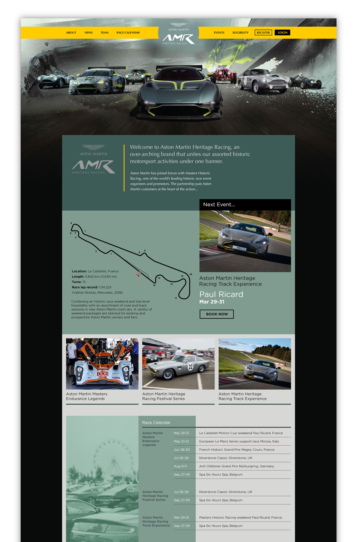
A slight deviation
Once the structure had been agreed, the team at Aston Martin were keen to see how this would translate in the final design.
Whilst managing expectations is important, it’s also crucial to understand how the business works and as there was so much excitement around this, It was acceptable to ‘jump ahead’ and give them an early view of the UI design.

Design
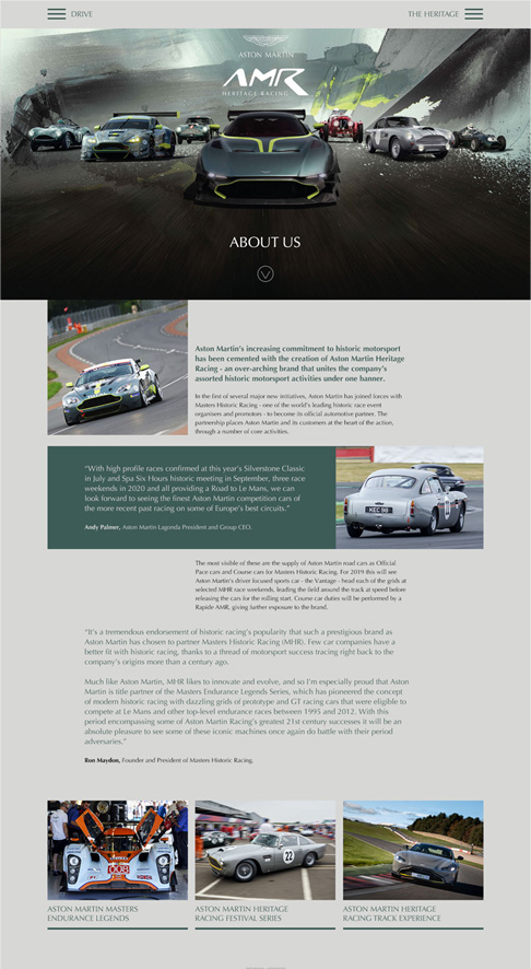
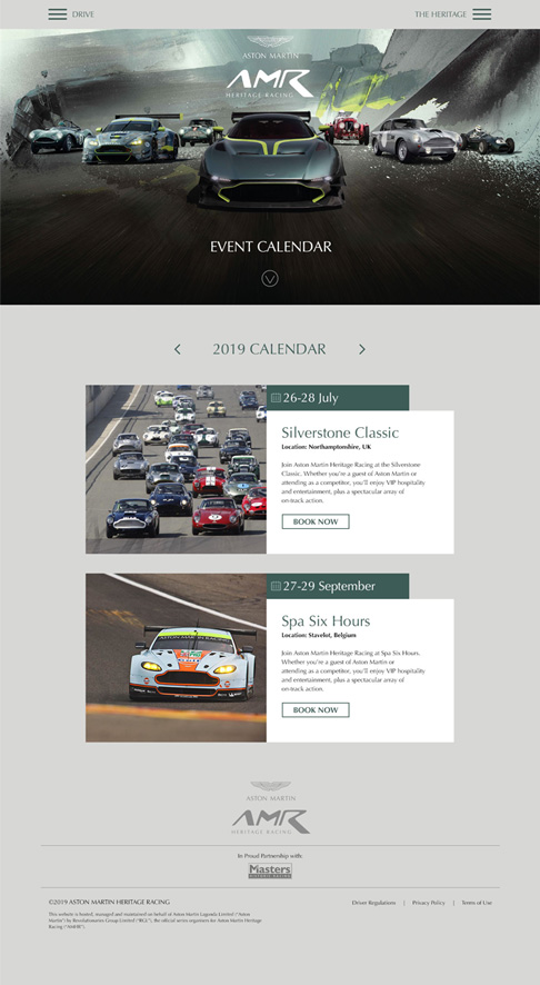
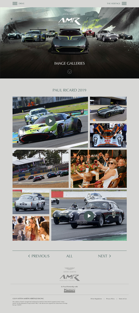
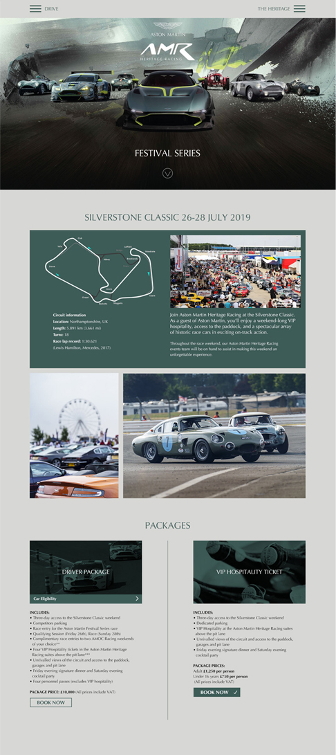
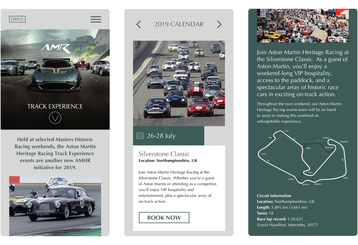
Early in the design process I identified how we could build the page layouts using repeat components. For instance: calendar, booking forms and feature links that can be built once and integrated into the pages throughout the site. Thinking ahead and involving developers at this early stage, saved time and created efficiences further down the line.
Booking forms
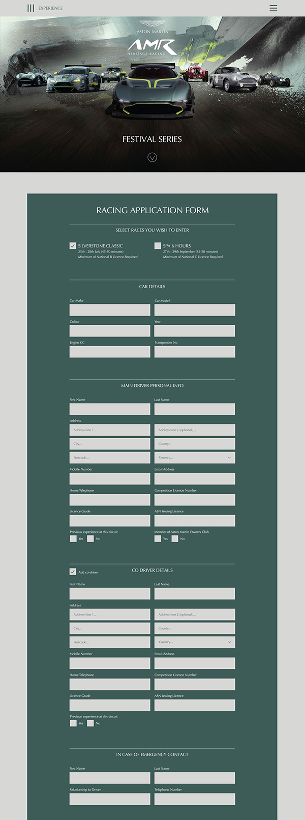
The race drivers booking form had to capture a lot of information. Where possible I optimised the question sets and grouped them into logical sections.
The sections are dynamic and will only appear based on the previous selections.
Software integration.
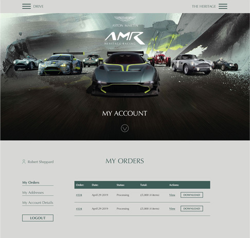
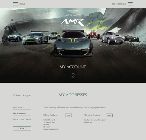
The technology team wanted to use a third party solution to handle bookings, e-commerce and user accounts. They chose an off the shelf events solution that can also generate e-tickets. Some design work was done to re-skin this and create a seamless journey for the user. Using established software in this way dramatically cuts down the development time, but crucially also reduces the time to take the initiative to market.
